

Hero z miejscem na tekst
Kadr projektowany pod layout: sylwetka po jednej stronie klatki, druga strona zostaje cicha i pusta — realne miejsce na nagłówek, CTA albo logo. Jasne, ciepłe tło studyjne, kontrolowane światło i pełna czytelność produktu w części kadru przypadającej modelce.
Przestań przycinać i rozciągać zdjęcia, żeby zmieścić nagłówek. Ten styl projektuje kadr tak, jak projektuje się baner: sylwetka pracuje po jednej stronie klatki, druga strona zostaje spokojna, jednolita i pusta — pionowy pas o szerokości około 40% kadru, w którym nie ma niczego poza tłem. Produkt zostaje w pełni czytelny, bo modelka jest w swojej części kadru powiększona, a nie zmniejszona. W paczce dostajesz layouty z miejscem na tekst po lewej i po prawej, w jednym świetle i na jednym tle.
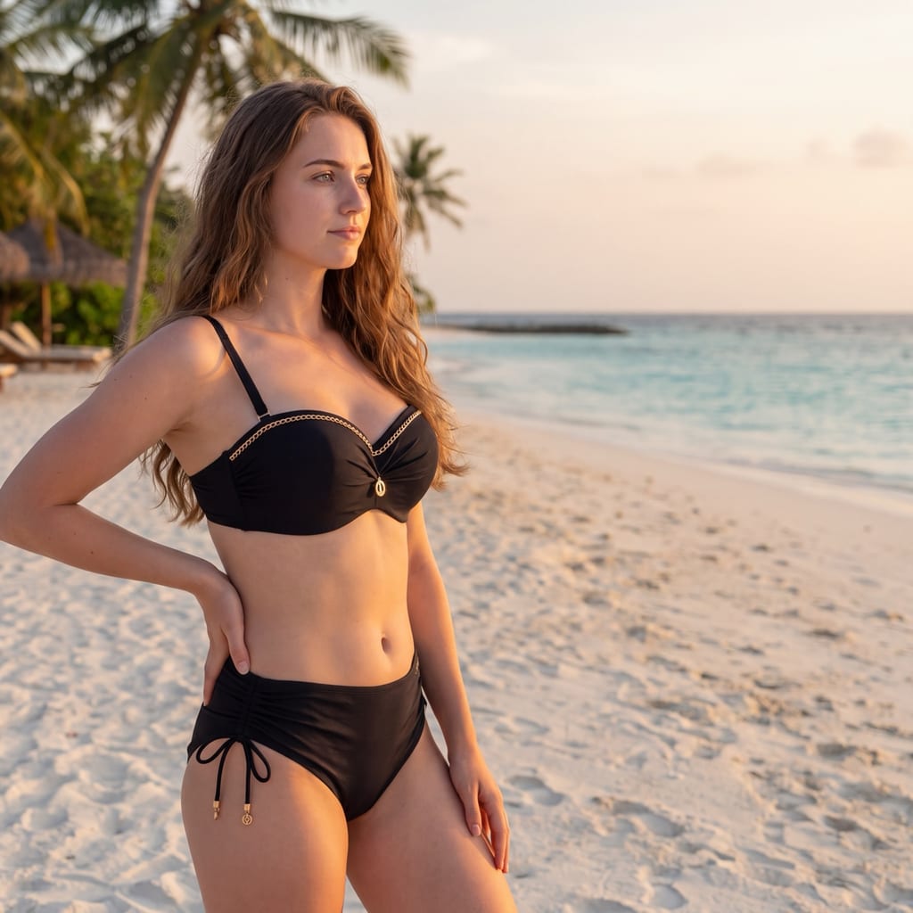
Galeria
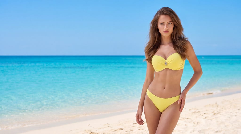
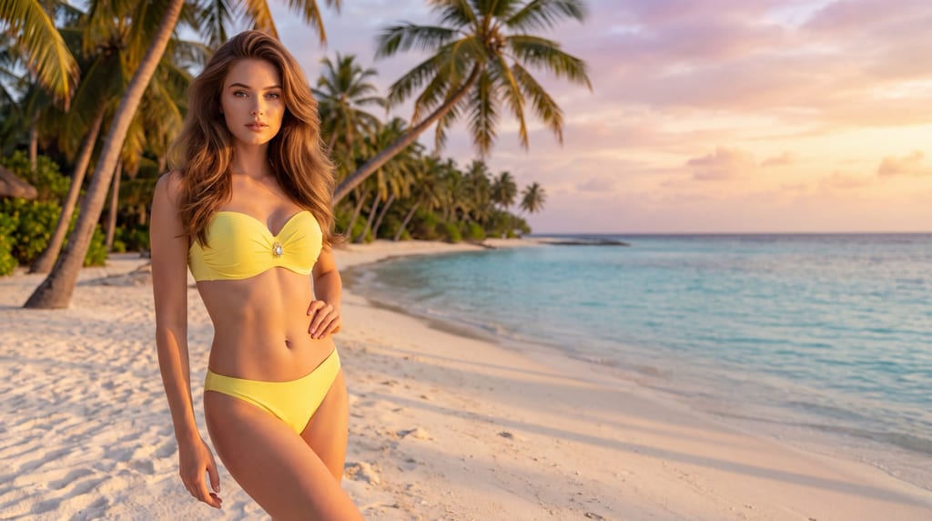
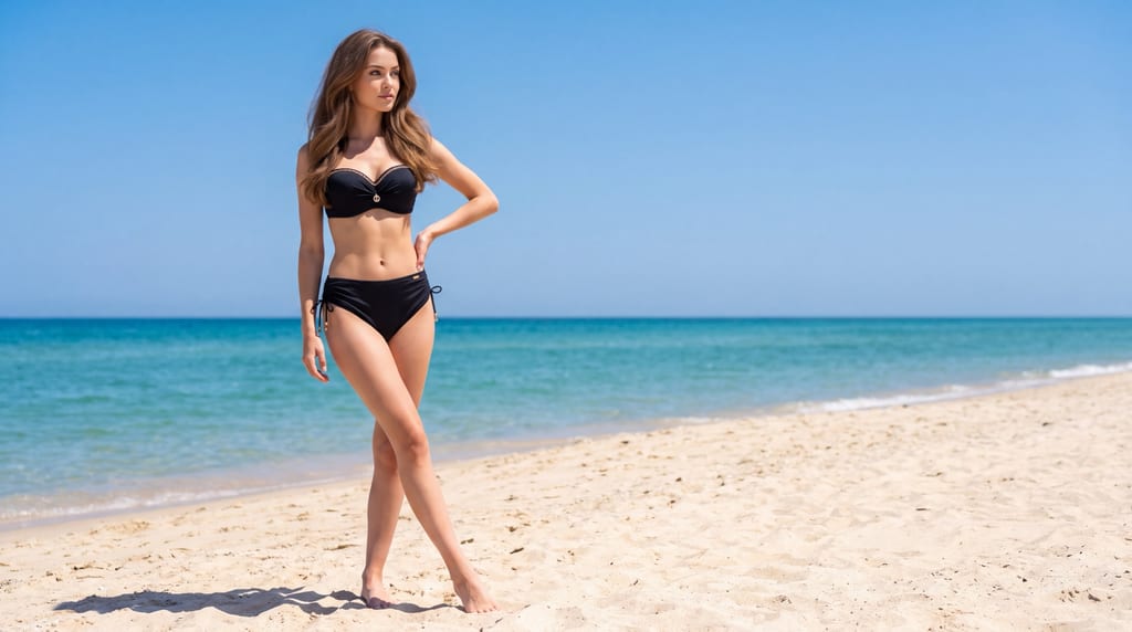
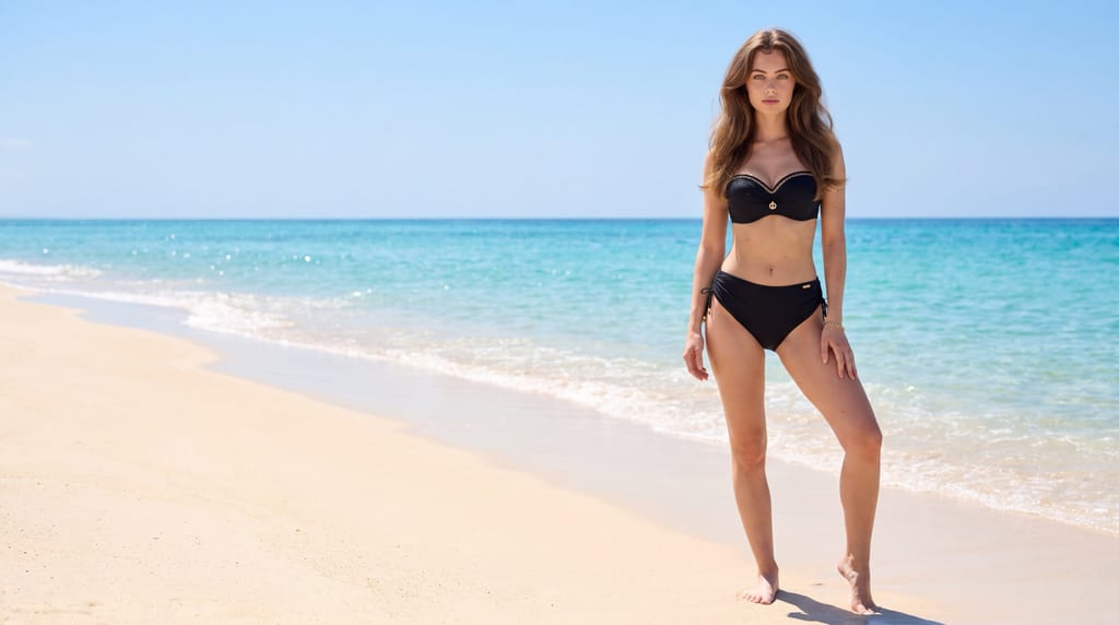
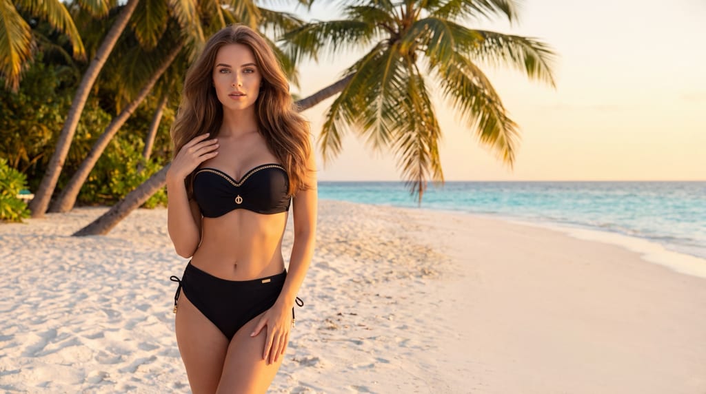
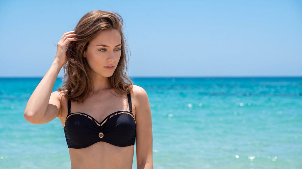
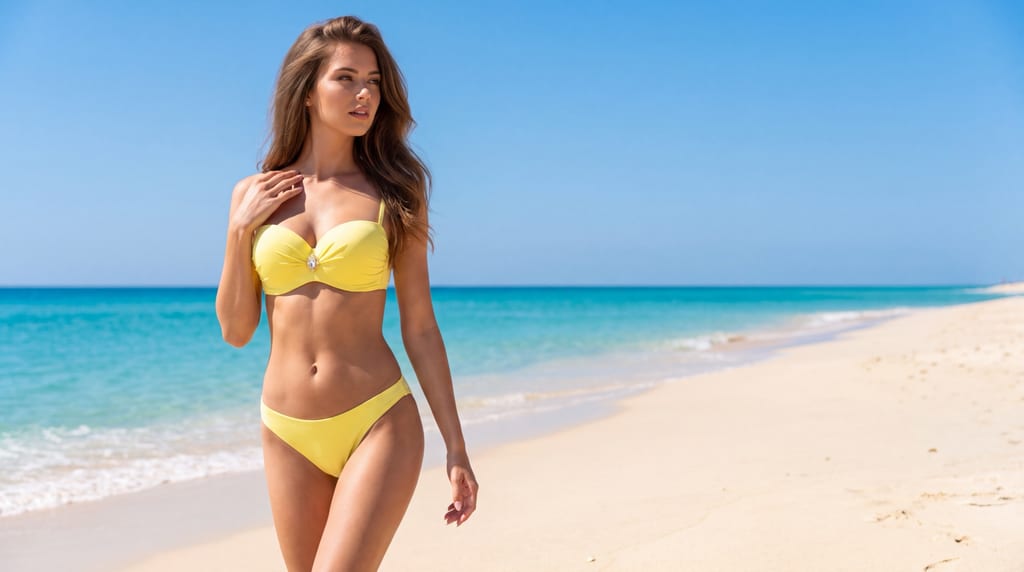
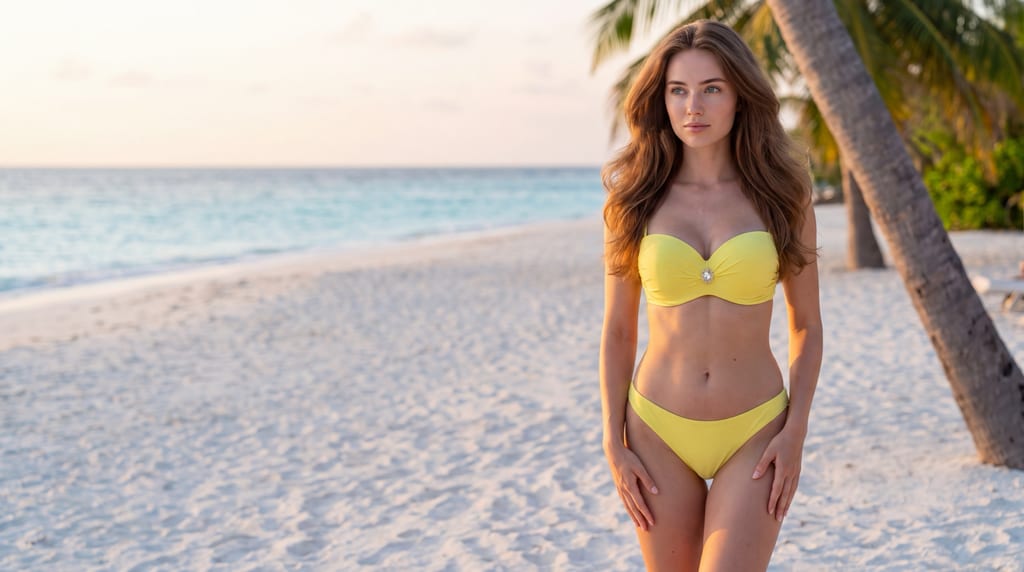
Najlepsze do
Najlepszy do reklam, hero na landing page, kreacji paid social i display, nagłówków mailingów i banerów kategorii dla bielizny i swimwear. Wybieraj go, gdy zdjęcie ma być podkładem pod komunikat — nagłówek, cenę, kod rabatowy, logo — a nie samodzielnym kadrem. Dobrze wypada przy fasonach o wyrazistej linii, bo sylwetka czyta się tu jako kształt na pustym polu. Na kartę produktu i porównania fasonów użyj stylu katalogowego, na sesję w realnym wnętrzu — stylu wnętrzowego.
Wymagania wejściowe
Wgraj packshot tej strony produktu, którą chcesz pokazać — sesja fotografuje jedną stronę (przód ALBO tył); komplet przód + tył to dwie sesje. Modelka jest wymagana: to styl na sylwetce, nie packshot. Modelkę (karnację, budowę, niedoskonałości skóry) ustawiasz w modelce — styl jej nie wygładza. Sceneria nie jest potrzebna: styl ma własne ciepłe, jasne tło studyjne dobrane pod czytelność tekstu. Jeśli podepniesz własną scenerię, to ona poprowadzi tło — wybieraj wtedy wyłącznie spokojne i jednolite (gładka ściana, tynk, równomierne tło), bo wzorzyste i narracyjne wnętrze odbiera temu stylowi sens.
Wytyczne jakościowe
## Quality guidelines ### Style core A layout-first hero register for swimwear and lingerie photographed on a model against one warm, light studio seamless — images built the way a banner is built: the figure lives on one side of the frame, and the other side stays a quiet, uniform, genuinely usable reserve for a headline, a call to action or a logo. The world is a controlled studio with a single pinned background tone, one directional key and a deliberately asymmetric frame. This is a campaign register, but the campaign lives in the composition rather than in pose amplitude: the pose is controlled and strong, the expression is composed and confident, and the frame is designed before the model stands on the set. It is decidedly NOT a catalog grid (the frame is never centered and never full), NOT a candid moment (nothing here is caught — everything is placed), and NOT a styled narrative set (a prop or a piece of scenery entering the reserve destroys the whole point). The value of the register is that a designer receives ten finished assets: type goes on, nothing has to be cropped, stretched or cloned first. - Commerciality level: `campaign` — advertising-grade and layout-ready, kept clearly sellable, with the product fully legible in the part of the frame the figure occupies - Dominant character: composed, graphic, asymmetric, warm-neutral, confident, designed-not-caught - Image priority: the composition leads — the relation between the figure and the empty field is the subject of the frame; the product stays fully readable inside the figure's share, and the expression supports the frame rather than competing with it - Directional references: hero banners and paid-social creatives for premium swim and lingerie brands, landing-page openers where the headline sits beside the figure, above-the-fold email creatives, poster-logic frames where type and figure share one plane - Style-anchoring words: layout-first hero, one quiet reserved band, off-centre silhouette, warm light stone seamless, type-ready in every frame ### Product role in frame The product (swimwear / lingerie) is the readable hero inside the figure's share of the frame — and the reserve is never paid for with it. Because the composition gives away about 40% of the frame width, the figure is scaled UP inside the remaining ~60% rather than shrunk to make room: the garment zone must occupy as large a share of the figure's side as it would occupy in a full frame, so fit, cut, fabric surface and construction read at banner size and survive being viewed small on a phone. Hands, hair and pose stay clear of the garment's readable zones. The warm light background sits tonally close to fair skin and to ivory, blush and nude garments, so the outline is protected on purpose: the directional key, the distance between the model and the seamless and the medium contrast keep the edge of the body against the background AND the edge of every strap, band, cup and hem against the skin. When the input shows the back of the product, the back of the garment becomes the readable hero and the model is posed from behind, with the reserve unchanged. - Product role: hero on the silhouette — the garment leads as the readable subject inside the figure's share; the composition amplifies it by giving it an uncluttered field to sit against, never by shrinking it - Visibility level: fully readable in the clear majority of frames, with a minority where a gesture or a crop partially obscures it, plus a construction / material detail layer - What the style exposes: cut and coverage on the body, the line the garment builds against an empty field, strap and band placement, fabric surface and tension, construction edges (seams, cups, closures, hems) - Figure-to-background separation: the figure's outline holds against the warm light seamless in every frame — carried by the key's direction, the distance from the background and the medium contrast, never by recolouring the background - Skin-to-garment separation: when the garment's hue is close to the skin tone (nude, blush, ivory, tan), the key and the grade keep every edge of the garment readable against the body; the garment never dissolves into the skin - Acceptable obscuring: minimal to moderate — a gesture or a crop may cover a small part in a minority of frames if cut and fit still read; never unreadable in the core of the pack - Product presentation character: composed, advertising-grade, confident, clearly sellable - Product scale rule: the garment reads at a glance at banner size; a frame in which the figure was shrunk to enlarge the reserve is a failed frame ### Light Default light — applied when no scenery is linked, or when the linked scenery does not name a directional light, a time of day or weather: one soft-directional studio key at ~40° azimuth off the camera–model axis, on the camera side, positioned on the same side of the frame as the quiet reserve, its centre just above the model's eye line (the ~40° is azimuth measured from the camera–subject axis, not from the room; the key sits just above the eyes, never a low uplight), a broad even fill on the opposite side that keeps every part of the garment out of black, and a separate broad, even wash on the seamless so the background holds one tone with a gentle gradient across the reserve. The model stands well off the background, so no cast shadow of the figure lands on the seamless at all; the key's placement on the reserve side is the second guard, throwing whatever residual shadow exists away from the field the type will occupy. Discipline — always, whatever the light source: one dominant directional source that models the body and the garment's structure at medium contrast, with open readable shadows, held highlights, and a background plane that stays even, unbroken and free of hotspots, hard cast shadows and graphic patterns. This discipline applies on top of whichever source is resolved: a linked scenery may set WHERE the light comes from, the preset keeps the medium-contrast, type-protecting CHARACTER. - Source type: studio, controlled; one soft-directional key, a broad even fill, and a separate even wash on the background plane - Default source direction: ~40° azimuth off the camera–model axis, on the camera side, on the same side of the frame as the quiet reserve, centre just above the eye line — applied when no scenery is linked, or when the linked scenery does not name a directional light, a time of day or weather - Handedness rule: the key follows the reserve. Its character, azimuth and elevation are identical in every frame of the pack; only the side mirrors, exactly as if the whole set were flipped with the composition. Resolve it deterministically per frame — never leave the side to chance - Hardness: soft to medium-soft; shadow edges gentle with a wide transition, so the figure models without drawing a graphic shape anywhere near the reserve - Light-to-shadow contrast: medium — enough modeling for volume, fit and the figure's outline against a close-toned background, never enough to drop the garment into darkness or to break the background's evenness - Role of fill: broad and even on the shadow side; the garment never falls into black, and the fill never flattens the figure into a shadowless front wash - Background lighting: its own even, broad wash across the seamless; the reserve reads as one continuous tone with a soft gradient, with no hotspot, no falloff step and no pattern crossing it. The gradient stays shallow enough that a headline holds the same contrast at the top of the band as at the bottom - Shadow quality: soft, open and grounding on the figure; absent from the reserve - Color temperature: neutral; the preset's neutral white balance applies only when the preset's default light is the source; otherwise white balance follows the resolved light source, one per frame, and the grade never recolours a linked scenery - What the light should model: the garment's surface and construction first, then the body's volume and its outline against the background, then the evenness of the plane the type will sit on - Light discipline (always, whatever the source): one dominant directional source, medium contrast, open shadows, held highlights, an even and unbroken background plane ### Color and tonality Warm-neutral, contemporary tonality whose two jobs are true product color and a legible plane for type. The default background (used only when no scenery is linked) is ONE warm, light stone-neutral seamless — sRGB #DCD6CC ≈ CIELAB L* 86 / a* 0 / b* 6 — with a soft gradient falloff: light enough that dark typography holds full contrast against it, warm enough to sit apart from the cool neutrals of the studio registers next to it, and even enough that a headline never crosses a tonal step. It is deliberately NOT pure white, NOT a mid-grey, NOT bright near-white and NOT a saturated beige or sand. Saturation is natural and restrained so the garment carries the only strong hue in the frame — which matters more here than anywhere, because the designer's brand color will land beside it. Contrast medium; blacks deep but open; whites clean and neutral; highlights held so the background never blows out under the type. - Palette: warm-neutral and restrained — real skin + true product color + the warm light stone seamless (#DCD6CC only when no scenery is linked); the product is the only strong hue in the frame, so brand color added in layout does not fight the image - Background tone (default, closed axis): sRGB #DCD6CC ≈ CIELAB L* 86 / a* 0 / b* 6, one single value with a soft gradient falloff — never a family, never a range, never drifting toward white, mid-grey, cool blue or a saturated sand between frames - White balance: neutral; follows the resolved light source; the preset's neutral value applies only when the preset's default light is the source; the grade never recolours a linked scenery - Saturation: natural and restrained; the garment's own hue stays true and untouched - Contrast: medium — modeling on the body, evenness on the plane - Exposure: precise; the garment exposed correctly, the background held below clipping so the reserve keeps its tone and its texture-free smoothness - Highlights character: neutral and controlled, including across the whole reserve - Shadows character: soft, open, neutral — grounding on the figure, absent from the plane - Blacks: deep but open — dark garments keep their internal construction detail - Whites: clean and neutral — white and ivory garments separate from the warm seamless through the key's modeling and the figure's distance from the background, never by recolouring the background - Overall tonal character: contemporary, warm-neutral, advertising-grade, quiet enough to carry type - Faithfulness of the product's own hue takes precedence over the grade; the grade never recolours a linked scenery ### Lens and perspective feel One pinned focal length: **PIN ~85mm in feel — one single value for the entire session, no ranges (never write "50–85mm in feel")**, written identically on every frame, so facial geometry and body proportions stay constant across the pack and a designer can place two frames of the same session side by side in one layout without the model reading as two different people. The short-portrait length also does the compositional work this preset needs: it compresses the plane behind the figure into an even field rather than opening a receding space, which is exactly what the reserve must be. A wider length is allowed ONLY when the idea explicitly calls for it, never as a per-frame default. Aperture / depth of field is a closed axis resolved once for the whole session: one moderately open value, **~f/5.6 in feel**, deep enough that the entire garment is sharp from strap to hem and the construction detail layer holds, open enough that the seamless renders as a smooth, even plane with no accidental texture under the type. Never sourced from the scenery. Camera at eye level as the base; a deliberate slight low angle is available as a hero device (it lengthens the figure against the empty field), a high angle as an accent — neither may tilt the frame, bend the vertical edge of the reserve or deform proportions. - Focal length: **PIN ~85mm in feel — one single value for the entire session, no ranges (never write "50–85mm in feel")**; a wider length is allowed ONLY when the idea explicitly calls for it, never as a per-frame default; never taken from the scenery - Aperture / depth of field: ONE moderately open value (~f/5.6 in feel) resolved for the whole session and held identical on every frame — the full garment sharp, the seamless smooth and even; never sourced from the scenery - Camera distance: medium to far, so the figure and its reserve both fit the frame at the pinned length; closer for the construction detail layer — same focal length throughout - Perspective: eye level as the base; a slight low angle as a hero device; a high angle as an accent; verticals stay vertical and the frame is never tilted - Depth of field character: the figure and garment sharp, the plane behind rendered smooth and quiet — a flat field, not a melted or bokeh-broken background - Sharpness character: as a real lens renders it — neither clinical nor soft - Gear character: a full-frame camera with a short-portrait prime lens, controlled studio strobes - Aspect ratio: no rigid requirement; the prompter picks (banners and landing heroes often 2:3 / 4:5 / 16:9, social 4:5 / 9:16). The reserve is defined as a SHARE of the frame width, so it survives every ratio — a wider format widens the reserve, it never removes it ### Composition language This is the section that carries the preset. Every frame is built as a layout: the frame is divided into a **figure side of roughly 60% of the frame width and a quiet reserve of roughly 40% of the frame width**, and the reserve is a full-height vertical band that stays empty — no part of the body, no hair, no limb, no fabric end, no prop, no cast shadow, no gradient step, no detail of any kind enters it. Which side the reserve sits on (left or right) is decided per frame and is the composition's one open axis; the share is not. The figure is placed off-centre against the outer edge of its own side, its mass and its direction of attention pointing across the frame into the reserve, so a headline placed there reads as belonging to the same image. Height matters as much as width: the upper part of the reserve is where a headline usually sits, so nothing crosses it — raised arms, flying hair and tall accessories resolve inside the figure's share. One plane only: the figure against the seamless, separation carried by the key and the tonal difference between skin/garment and the #DCD6CC background. No foreground element, no layered depth, no environmental framing — depth would put focus competition under the type. - Frame type: leads with 3/4-length / American frames and full silhouettes (the figure reads as a shape against the field), a portrait / bust share where the product sits high on the body, plus a construction / material detail layer - The reserve (closed axis): a full-height vertical band on one side of the frame, ~40% of the frame width, kept empty of the figure and of any detail, in EVERY frame including the detail frames - Reserve side (open axis): left or right, chosen per frame — the pack deliberately delivers both handednesses so one session serves layouts of both kinds - Object placement: off-centre by rule — the figure sits toward the outer edge of its own ~60%, never centered, never straddling the boundary of the reserve - Direction of attention: the figure's facing, gaze or gesture leads across the frame into the reserve in the majority of frames, so the empty field reads as intentional rather than as a mistake - Negative space: high and DESIGNED — this is the preset's signature and the reason it exists; it is a reserved zone, not incidental breathing room - Symmetry: deliberately asymmetric; symmetry belongs to the catalog register, not here - Open / closed composition: open as the rule — the composition breathes toward the reserve and a crop may cut the figure at its own outer edge; the reserve side is never the side that cuts - Number of planes: one — the figure on the seamless; no foreground, no layered depth - Separation from background: the key's modeling plus tonal contrast against #DCD6CC; never a rim-light trick, never background recolouring - Room for copy: the definition of the style, not an option — a frame without a usable reserve is a failed frame - Overall composition character: designed banner logic — asymmetric, off-centre, quiet on one side, product-legible on the other ### Pose language Posing is controlled, composed and graphic — strong, but built to be read as an outline. The body works a held shape with a clear contour: weight settled on one leg, a worked line through the torso, an arm shaping the silhouette, a turn that opens the garment to the lens. Amplitude is contained-to-strong rather than sculpturally extended: the pose must resolve into a shape that a designer can read at a glance beside type, and every limb resolves inside the figure's ~60% — nothing reaches into the reserve, nothing exits the frame on the reserve side. Expression is composed and confident: self-possessed, present, at ease with the camera; it supports the frame rather than becoming its subject, and it defaults away from smile-as-default, sweetness, coyness and worked fashion theatrics. Where the pose turns the head, it usually turns toward the reserve, so the reader's eye travels the way the layout wants it to travel. When the input shows the back of the garment, the same composed, contour-led stance reads from behind. - Expression: composed, confident, self-possessed; reads whenever the face is visible; never coy, never sweet, never theatrical - Pose dynamics: semi-static to controlled-dynamic — held shapes with real body tension and small natural adjustments; suggested motion only where it stays inside the figure's share and sharp - Pose amplitude: contained to strong — enough tension to carry a hero frame, always resolving into one legible contour; sculptural overload that scatters the outline is off-register here - Body openness: open and readable — the body squared or angled so the loaded side of the garment stays fully to the lens - Line tension: medium-high but disciplined — the line is drawn for the silhouette, not for its own drama - Posing character: composed `fashion` for advertising — camera- and frame-aware, aware of where the empty field is - Contact with the surroundings: the studio floor is the only surface there is — a low or seated stance may take weight on it with a worked line, in a small minority of frames and always with the reserve holding its full height; there is nothing else on a seamless to brace against, and the relation the pose really works with is the relation to the empty field - Eye contact: mixed — a calm direct look to camera as the hero anchor, or a gaze across the frame into the reserve as the layout device - Spontaneity level: directed — every stance is placed; small natural micro-adjustments keep it from reading stiff - Body-to-product relationship: the body presents the product and builds the shape; the garment stays readable, never dropped below the sales floor ### Movement and physics The style is essentially frozen. Motion is not a device here: a flying hair end or a swinging fabric edge is precisely what breaks a reserve, and a designer cannot place type over an unpredictable silhouette. At most a small, held motion cue — a settled weight shift, a hand coming to rest, a shoulder turning — and it resolves entirely inside the figure's share. Everything is sharp; no motion blur anywhere, least of all on the product. Hair sits naturally, stays clear of the garment's readable zones and never crosses into the reserve. Fabric behaves under real gravity: the garment sits as it truly sits, with no wind device, no invented tension and no styling illusion. - Static vs movement: static to held — set stances with small natural adjustments - Frozen vs blur: fully frozen and sharp; no motion blur - Hair/body: natural and settled; kept clear of the garment's readable zones and out of the reserve - Elements: none — no wind, no water, no environmental devices; the plane behind the figure stays undisturbed - Physics: real gravity on fabric and hair; the silhouette that the layout was designed around is the silhouette the frame delivers ### Relation to scenery The style's world is a controlled studio plane, and that plane is the preset's own default, not a location statement. The default background (used only when no scenery is linked) is the ONE warm light stone seamless defined in `Color and tonality` — sRGB #DCD6CC ≈ CIELAB L* 86 / a* 0 / b* 6 — with a soft gradient falloff: a non-narrative, detail-free field on which the figure reads instantly and type reads without competition. A linked scenery owns the location and backdrop when the user supplies one, and the preset's layout discipline then applies on top: the reserve still holds ~40% of the frame width, and the camera is positioned so that the part of the scenery falling inside the reserve reads as a calm, uncluttered surface. This style is at its best with a plain uniform backdrop or with no scenery at all — a busy, narrative or highly textured scenery takes away exactly the thing the preset sells, and the public fields say so. - Relationship to space: a flat, non-narrative studio plane by default; a linked scenery leads the location when supplied, with the reserve discipline applying on top - Scene depth: flat — one plane, soft falloff; no layered depth, no foreground - Background activity: none by design — the plane is silent, and the reserve is its quietest part - Space scale: intimate studio; the frame is about the figure and the field beside it, not about a place - Default background: the warm light stone seamless #DCD6CC (CIELAB L* 86 / a* 0 / b* 6) — one value, not a range, not a family; used only when no scenery is linked - Scenery selection guidance carried by the style: uniform walls, plain plaster, a smooth gradient backdrop and other calm, low-detail surfaces preserve the reserve; narrative interiors, patterned surfaces and detailed environments do not - The attached scenery owns the location and backdrop when linked; the preset's light discipline, the layout reserve, the camera pins and the grade discipline still apply on top of the resolved source ### Props and styling behavior The style is strictly uncluttered — no props, no set elements, and accessories reduced to the minimum. Every additional object in a layout frame is a second subject the designer did not ask for, and anything that could drift into the reserve is a direct threat to the frame's purpose. Accessories on the model are optional and, when present, are a single delicate piece in a small minority of frames, always inside the figure's share, never tall, never reflective enough to draw the eye off the garment. Footwear is a session styling layer: bare feet are the quiet default, a strong-lined heel is a minority accent that lengthens the silhouette in full-length hero frames. The preset does not set the model's hair styling, make-up or skin finish — these come from the casting card (Mannequin input) and the preset must not override them; the register only asks that hair sits settled, clear of the garment and out of the reserve. - Props: none — no environmental or styling objects, nothing held, nothing on the plane - Accessories: optional and minimal — at most a single delicate piece, in a small minority of frames, always within the figure's share - Accessories = session styling layer, not the model's identity — the model is a separate, clean input (frequency is set in Quantity) - Footwear: session layer — bare feet as the default, a strong-lined heel as a minority accent in full-length frames - Hair, make-up and skin come from the card; the preset only asserts non-override (it does not smooth, restyle or beautify them) - Hair movement as a POSE cue is deliberately restrained here — a settled placement serves the silhouette better than a flip, and nothing may cross into the reserve - Avoid (Prompter instruction — formulate final values positively): held objects, set dressing, jewellery stacks, headwear, anything tall or reflective, and anything at all positioned on the reserve side of the frame ### Post-production and finish Finish is even, exact and quiet — the image is a substrate for a layout, so the grade must not add anything a headline will have to fight. Grain none (a clean digital target): grain in the reserve reads as noise under type and costs nothing to omit here, since there is no environmental texture the frame is trying to preserve. Clarity sits at a natural, photographic level — fabric weave, seams, edges and construction read fully, with the contrast curve left where a real camera puts it and the background's smoothness intact. No vignette at all: edge darkening would land directly on the corner where the logo goes. Retouch minimal: natural skin texture and features preserved. The preset does not specify the model's skin, make-up or hair; it only requires that the render not smooth away or override the skin realism and identity supplied by the Mannequin input. Color exact — the garment's hue as true as the file allows, because the layout's brand color will be judged next to it. - Grain: none — clean digital, so the reserve stays a smooth field for type - Texture: real fabric and skin texture preserved and legible on the figure; the plane behind stays free of texture - Clarity: natural and photographic — full readability of weave, seams and construction, with the tonal curve as a real camera renders it - Vignette: none — no edge darkening anywhere, least of all in the reserve - Retouch: minimal — light cleanup only, never at the cost of skin or fabric texture - Skin: the preset does not specify the model's skin, make-up or hair; it only requires that the render not smooth away or override the skin realism and identity supplied by the Mannequin input - Overall finish: even, exact, layout-ready — a photograph designed to be built upon - Avoid (Prompter instruction — formulate final values positively): resolution or quality tokens of any kind, added micro-contrast sharpening, tone-mapped highlight compression, and any post effect that puts texture, noise or darkening into the reserve ### Style render properties - Render character: true-to-life photographic rendering. The frame must read as a real photograph taken with a real camera in a working studio — a full-frame camera, a short-portrait prime lens, controlled studio strobes. Carry this into `Rendering_Style` as its own value — `True-to-life photographic rendering.` — and resolve it identically on every frame of the session. The style's register (campaign, hero, advertising layout) belongs in `Session_Concept` and `Output_Goal`; `Rendering_Style` carries ONLY the photographic character, never a genre label, never a quality or fidelity adjective. - The frame is divided into a figure side of roughly 60% of the frame width and a quiet reserve of roughly 40% of the frame width. The reserve is a full-height vertical band on one side, kept completely empty: no body part, no hair, no fabric, no accessory, no prop, no cast shadow, no gradient step, no pattern and no detail of any kind enters it. This holds in EVERY frame, including the construction detail frames. Which side the reserve sits on is decided per frame; the ~40% share is not. - The figure is placed off-centre, toward the outer edge of its own side, and its facing, gaze or gesture leads across the frame into the reserve in the majority of frames. - The default background (used only when no scenery is linked) reads as ONE warm, light stone-neutral seamless — sRGB #DCD6CC ≈ CIELAB L* 86 / a* 0 / b* 6 — with a soft gradient falloff; never pure white, never mid-grey, never bright near-white, never a saturated beige or sand, and never a different value between frames. When a scenery is linked, the scenery owns the background and the reserve discipline applies on top: the camera is positioned so the part of the scene falling inside the reserve reads calm and uncluttered. - Light must read as one soft-directional studio key at ~40° azimuth off the camera–model axis, on the camera side, on the same side of the frame as the reserve, its centre just above the eye line, with a broad even fill on the opposite side and a separate even wash on the background plane; medium contrast; open readable shadows; held highlights. The model stands well off the background, so no cast shadow of the figure reaches the seamless. The key's character, azimuth and elevation are identical across the pack; only its side mirrors with the reserve, and it is resolved deterministically per frame. This discipline applies on top of whichever light source is resolved, and each frame resolves to exactly one white balance. - Focal length is PINNED at ~85mm in feel and aperture at ~f/5.6 in feel for the whole session — one value each, never a range, never taken from the scenery — so face geometry and body proportions stay constant, the full garment stays sharp, and the plane behind the figure renders smooth and even. - The product (swimwear / lingerie on the body) stays the readable hero inside the figure's share in the majority of frames — fit, cut, fabric and construction must read at banner size. The figure is scaled up within its ~60%; it is never shrunk to enlarge the reserve. - The figure's outline holds against the warm light background, and every edge of the garment holds against the skin even when their tones are close (nude, blush, ivory, tan) — carried by the key's direction, the distance from the background and the medium contrast, never by recolouring the background or the garment. - The preset does not specify the model's skin, make-up or hair; it only requires that the render not smooth away or override the skin realism and identity supplied by the Mannequin input. - Pose reads composed, confident and graphic — a held shape with one legible contour, all limbs resolving inside the figure's share. Expression stays composed and self-possessed rather than coy, sweet or theatrical. Movement stays frozen and sharp. - The background plane stays even and free of texture, grain, vignette and pattern, so the reserve carries type without competition. - Body proportions stay believable; a deliberate slight low or high camera angle is allowed as a hero device, without deformation, without tilting the frame and without bending the vertical edge of the reserve. - The session photographs the one side of the product supplied in the input; the whole pack keeps that side toward the lens. - Overall the image must feel like a finished hero banner waiting for its headline — composed, asymmetric, quiet on one side and product-legible on the other — not a centered catalog frame, not a caught candid moment, and not a styled narrative scene. ### Allowed variability Variability applies only to the open axes. What stays disciplined across frames is the preset's own DNA: the ~40% reserve and its total emptiness, the #DCD6CC background default, the light character (medium contrast, ~40° azimuth, key just above the eye line, even background wash, no cast shadow on the plane), the pinned ~85mm focal length and ~f/5.6 aperture, the neutral grade, the grain-free and vignette-free finish, the composed pose register and the product-readability floor. Everything below is open. - WHICH SIDE the reserve sits on (left or right) may change between frames — this is the deliberate open axis of the layout, and the pack is expected to deliver both handednesses. The light's side mirrors with it; its values do not change. - The exact stance, weight distribution, arm shape, torso line and small natural micro-adjustments may vary — as long as they resolve into one legible contour inside the figure's share and keep the product-readability floor. - Frame / crop may move along the ladder (full silhouette ↔ 3/4-length ↔ bust/portrait ↔ construction detail) — always at the pinned 85mm and always with the reserve intact. - Head and face angle may vary (frontal, three-quarter, profile), including poses from behind; model identity is carried by the Mannequin input regardless of face angle. - Gaze direction may change (calm direct to camera, across the frame into the reserve, off frame, downward along the body line), as long as it stays composed. - Camera angle and height may move from eye level to a slight low angle or a high-angle accent, without tilting the frame. - The construction-detail layer may choose different construction points (strap, cup edge, band, closure, hem, weave) in different frames. - Whether a single delicate accessory or a strong-lined heel appears may vary (session layer, a small minority of the pack). - The degree of partial product obscuring may vary within "still fully readable in the core of the pack". - What may NOT vary: the reserve's share and emptiness, the background value, the light character, the focal length, the aperture, the grade, the pose register, or the readability floor. ### Session-level consistency Across the whole pack these stay constant, because the Prompter is stateless: the same ONE warm light stone seamless default (#DCD6CC ≈ CIELAB L* 86 / a* 0 / b* 6 — never a different value between frames) whenever no scenery is linked, or the same one linked scenery for the whole session; the same reserve discipline (a full-height vertical band of ~40% of the frame width, completely empty) in every single frame; the same light character (soft-directional key at ~40° azimuth just above the eye line, broad even fill, an evenly washed background plane, medium contrast, one white balance per frame); the same pinned ~85mm focal length and ~f/5.6 aperture; the same warm-neutral restrained grade with no grain and no vignette; the same composed, contour-led pose and expression register; the same minimal-retouch skin realism from the card; and the same product-readability floor. The reserve's SIDE is the one thing that deliberately alternates — a pack that delivered only one handedness would serve only half the layouts a campaign needs — and because the tone, the contrast, the camera and the key's values are identical, mirrored frames still read as one session. The pack must read as one uninterrupted studio session shot for one campaign: ten frames a designer can set type on in one afternoon without re-matching colour, light or scale between them. ### Conflict resolution Declared hierarchy — one deliberate shift from the default, with a business reason: this preset exists to produce layout-ready assets, and a frame on which a headline cannot be set is not a weaker asset but an unusable one. The layout reserve is therefore raised to the level of world consistency, above pose amplitude and campaign expression. Product readability and render realism stay above it — the reserve is never bought with the product. 1. Product readability and fidelity: the garment fully readable inside the figure's share at banner size, its hue exact, fit and construction legible, every edge holding against close-toned skin and against the close-toned background. 2. Realism and render believability: true-to-life photographic rendering, real skin from the card (non-override), true proportions at the pinned focal length, believable physics and gravity. 3. The layout reserve and the consistency of the studio world: the ~40% empty band in every frame, one background value, one light character, one camera, one grade — the pack's signature and its commercial reason for existing. 4. Pose amplitude, expression and campaign accent — permitted inside the margins left by 1–3. When a linked scenery's own space conflicts with the preset's default studio, the scenery wins the location (below product readability, render realism and model identity, which stay higher). The preset's default light and background apply for sessions without a scenery, or when the linked scenery does not name a directional light, a time of day or weather; a qualifying scenery's light leads, and the preset's medium-contrast, type-protecting light discipline applies on top. The focal and aperture pins are never overridden by the scenery — only an explicit per-batch Idea or suggestion may move them. If a pose, gesture or crop would fill the frame edge to edge, the pose gives way: the composition is rebuilt with the figure re-scaled inside its own share, never with the reserve reduced. If a linked scenery puts detail, pattern or clutter where the reserve must be, the camera is repositioned so the reserve falls on a calm part of the scene; the preset does not invent a backdrop and does not silently drop the reserve. If the figure would have to be shrunk so far that the garment stops reading at banner size, product readability wins and the frame is recomposed at a tighter crop — the reserve holds its share of a tighter frame rather than the product losing its scale.
Wytyczne ilościowe
## Quantity guidelines ### Session goal By default 10 images in the pack. Main use: hero banners, landing-page openers, paid social and display creatives, email and newsletter headers, and sales materials for swimwear and lingerie. The pack's goal is to deliver ten finished layout substrates from one session: every frame carries the same warm-neutral studio world, the same camera and the same reserve, so a designer can build a whole campaign — several formats, several messages, both left- and right-aligned layouts — without commissioning a second shoot and without retouching a single frame to make room for type. The pack photographs ONE loaded product side; a campaign that needs both sides is two sessions. ### Shot mix About 40% 3/4-length / American frame (the workhorse — the garment zone is large in the figure's share while the whole shape still reads), 30% full silhouette (the hero shape against the empty field, the format's flagship frame), 20% portrait / bust (for products sitting high on the body: bras, bikini tops — the garment zone fills the figure's share), 10% construction or material detail (strap, cup edge, band, closure, hem, weave). Every frame — including the detail frames — holds the reserve: the detail lives inside the figure's ~60% and the band stays empty. All frames at the pinned 85mm. When the input shows the product's back, the same shot mix reads from behind (rear bust framing, 3/4-length back, full rear silhouette, back-construction detail), with the reserve unchanged. ### Perspective mix Product orientation = input, not preset. The input always shows one side of the product — the front or the back — and that loaded side dictates whether the model is posed facing the camera or with her back to it. The preset does NOT redistribute or assign this (no "X% front / Y% back"); it takes the orientation from the input and only varies the camera angle and height within it. The distribution concerns the camera setup with the loaded side kept to the lens: about 35% straight on (camera frontal to the loaded side — the most readable fit), 30% a slight 3/4 camera swing (the loaded side still fully readable, the silhouette gains shape against the field), 15% closer to profile (as far as the loaded side stays visible — the cleanest outline against the reserve), 12% a deliberate slight low angle (a hero device that lengthens the figure beside the empty band), 8% a high-angle accent. Angles do not deform proportions, tilt the frame, bend the vertical edge of the reserve, rotate the silhouette so the loaded product side disappears, or kill fit readability. The reserve holds its ~40% share at every camera setup, and the key's values stay constant regardless of angle. ### Gaze distribution About 30% calm direct gaze to camera (the hero anchor — the frame addresses the viewer while the headline sits beside her), 45% gaze across the frame into the reserve (the layout device — the model's attention carries the reader's eye to where the type will be, which is what makes the empty field read as intentional), 15% off frame away from the reserve or into the distance (independent, used when the composition already leans hard into the band), 10% downward or along the body line (fits detail and adjustment frames). Every gaze stays composed — present and self-possessed, never coy and never theatrical. This applies to frames where the face is visible; in detail frames the face may fall outside the crop. ### Interaction distribution About 70% directed neutral posing with no contact (there is nothing on a seamless to interact with — the body works its shape in the space beside the reserve), 25% self-contained gesture (a hand at the hip, at the collarbone, in the hair, an arm shaping the silhouette — always inside the figure's share and always clear of the garment's readable zones), 5% low or seated stances on the studio floor with a worked line, where the reserve still holds its full height. No environmental interaction and no props to interact with: this style's compositional partner is the empty field, not an object. ### Product visibility distribution About 55% garment fully readable on the body (the sales floor — the entire loaded side legible at a glance, at banner size), 25% garment readable while the silhouette leads the composition (the hero frames, where the shape against the field carries the image and the garment still reads), 10% partial obscuring from a gesture or a crop (never in the core of the pack, never a hand or hair across a cup, band or closure), 10% construction or material detail filling the figure's share. The pack leads campaign composition, but full readability stays a hard floor across roughly 55% of frames, and the reserve never pushes the product below that floor. ### Composition openness distribution About 70% open compositions (the figure placed against the outer edge of its own side, the frame breathing across into the reserve, a crop allowed to cut the figure at its own outer edge), 30% closed compositions (the whole figure composed inside its share, used where the full silhouette is the point). Openness here is the rule and it always opens toward the reserve — the band side is never the side where the figure is cut, and no crop ever eats into the band. ### Safe vs expressive ratio Copy-ready is 10/10 by construction: it is a Quality-level rule of this preset, not a share of the pack, so it is not distributed here. What is distributed is how much sales-safety versus campaign expression each of those copy-ready frames carries: about 60% safe + copy-ready (product-first frames that are instantly usable on a product-led ad or a category banner), 30% expressive + copy-ready (a stronger composed shape, the figure scaled and placed for impact, the garment still fully readable), 10% strong hero + copy-ready (the pack's flagship frames — the boldest legible contour against the widest field, built for an above-the-fold opener). Expression works through composition, scale and contour, never through losing the product-readability floor, the reserve or the consistency of the studio world. ### Spatial and depth mix 100% figure (or garment detail) against the one warm light seamless with a soft falloff — one plane, no layered depth, no foreground elements, no environmental frames. Separation comes from the key's modeling and the tonal difference against #DCD6CC, identical across the pack. Depth is deliberately absent: a receding space behind the figure would put detail and focus competition exactly where the type has to go. When a scenery is linked, the spatial mix follows that scenery for the whole pack, and the reserve discipline still applies — the camera is positioned so the band falls on a calm, uncluttered part of the scene. ### Recurring motifs or accessories frequency No props — 0/10 by design. The recurring motif is the layout discipline itself: the full-height empty reserve at ~40% of the frame width in 10/10 frames, the off-centre figure placement in 10/10, the pinned 85mm / f/5.6 camera and the one warm light stone plane in 10/10, and the medium-contrast key with an evenly washed background in 10/10. The figure's direction of attention leading across the frame into the reserve in roughly 7/10. The reserve sits on the left in roughly half the frames and on the right in the other half, so one session serves both layout handednesses. A single delicate accessory in at most 1–2/10 (session styling layer, never baked into the model identity, never on the reserve side); a strong-lined heel in at most 2–3/10 of the full-length frames, bare feet otherwise. The uniformity of the reserve IS the motif: the pack should be recognizable as this preset by the shape of its frames, not by any added element. ### Energy mix About 30% calm (composed, settled, quiet presence beside a large empty field), 25% confident-sensual (body awareness and warmth, composed rather than played to the camera — the natural register for lingerie in an advertising frame), 10% active (a small held motion cue, sharp and contained inside the figure's share), 35% strong / hero (the campaign-forward frames: the boldest contour, the widest field, the frames built to open a landing page). Even the calmest frames keep compositional tension — the pack's strength is the designed relation between a confident figure and the space held open beside her.
Wskazówki dla użytkownika
Wybierz modelkę i wgraj packshot jednej strony produktu. Nie podpinaj scenerii, jeśli chcesz gwarantowane, jednolite miejsce pod tekst. Generuj 8–10 zdjęć, żeby dostać layouty z pustym polem po obu stronach. Konkretny format banera i stronę, po której ma być tekst, wpisz w sugestiach sesji.
Rób
Uruchamiaj bez scenerii — ciepłe jasne tło o jednym tonie jest częścią stylu i to ono odpowiada za czytelność nagłówka. Generuj 8–10 zdjęć, żeby mieć kadry z pustym polem i po lewej, i po prawej stronie. Na komplet przód + tył zrób dwa wsady: osobna sesja na każdą stronę produktu. Jeśli potrzebujesz konkretnej strony pod copy albo konkretnego formatu, napisz to w sugestiach sesji — sugestie są nadrzędne nad stylem. Wybieraj fasony o wyraźnej linii: sylwetka czyta się tu jako kształt na pustym polu.
Nie rób
Nie oczekuj kadru wypełnionego sylwetką po brzegi — oddanie części klatki layoutowi jest tu celem, nie błędem. Nie podpinaj wzorzystych, narracyjnych ani mocno zagraconych scenerii: zabierają dokładnie to, co ten styl sprzedaje. Nie licz na rekwizyty, scenografię ani dramatyczne, graficzne światło — cień rzucony na tło rozbija pole pod tekst. Nie używaj go jako stylu na kartę produktu ani na porównania fasonów. Nie generuj bez modelki.
Powiązane style
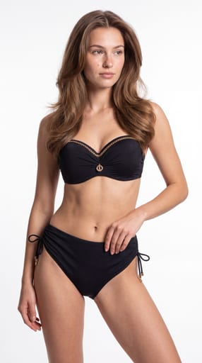
Czysty fason PDP
Czysty katalogowy styl PDP: modelka na jasnym neutralnym tle, kontrolowane światło, pół-statyczna poza. Fit, proporcje i konstrukcja produktu przed nastrojem — powtarzalna siatka zdjęć na kartę produktu.
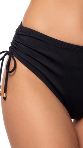
Makro detalu i konstrukcji
Studyjne makro jako dowód jakości: koronka, ścieg, fiszbina, splot, krawędź, okucie i napięcie tkaniny na ciele. Cała paczka jest warstwą detalu — 7–8 kadrów makro i półmakro plus kadry orientujące, w jednym grabiącym świetle i na jednym neutralnym tle.
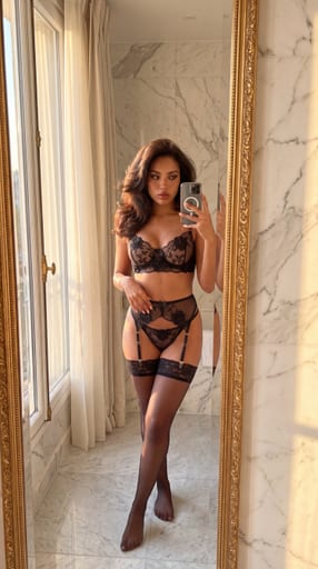
Natywny social w lustrze
Natywne treści social: pionowy kadr 4:5, lustro, telefon w dłoni i światło zastane prywatnego wnętrza. Zdjęcia wyglądają jak zrobione przez samą modelkę — ale są ostre, prawidłowo naświetlone i pełnowymiarowe, bez fejkowych artefaktów telefonu.
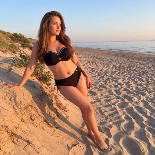
Twarde słońce na tynku
Letni styl kampanijny na twardym słońcu: modelka przy ciepłej, tynkowanej ścianie, ostry rzucony cień jako element kompozycji, wysoki kontrast i nasycony kolor. Jedno mocne, rozpoznawalne zdjęcie na sezon — nie kolejna miękka sesja na plaży.
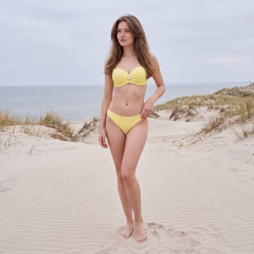
Wyblakły brzeg
Wyblakły słońcem, spokojny brzeg morza jako jeden świat dla całego katalogu: ten sam piasek, to samo zawoalowane światło, ta sama ogniskowa, ta sama cisza. Produkty różnych marek zaczynają wyglądać jak jedna sesja — a kolor każdego produktu zostaje wierny.
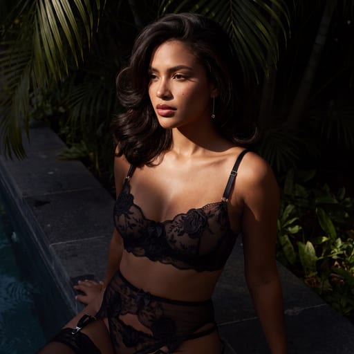
Chiaroscuro low-key
Rejestr low-key dla bielizny premium: jedno twarde kierunkowe światło, zero wypełnienia, większość kadru w głębokiej czerni. Światło wycina fragment sylwetki i wyciąga koronkę, taśmy i szwy w relief — produkt zawsze stoi w strefie światła.
Gotowy, aby rozbudować swoją bibliotekę kreacji?
Dodaj ten styl do swojego konta i zacznij tworzyć lepsze kampanie w kilka minut.