

Twarde słońce na tynku
Letni styl kampanijny na twardym słońcu: modelka przy ciepłej, tynkowanej ścianie, ostry rzucony cień jako element kompozycji, wysoki kontrast i nasycony kolor. Jedno mocne, rozpoznawalne zdjęcie na sezon — nie kolejna miękka sesja na plaży.
Zrób sezonowi jeden obraz, który zapamiętają — sylwetka przy ciepłej, tynkowanej ścianie w twardym, wysokim słońcu, z ostrym cieniem rzuconym na ścianę jako drugą figurą w kadrze. Kolor jest nasycony, bo takie jest światło; kontrast wysoki, bo słońce nie ma wypełnienia; kostium czytelny w każdym kadrze, bo zawsze stoi w pełnym słońcu. To jedyny twardy plener w całej bibliotece stylów.
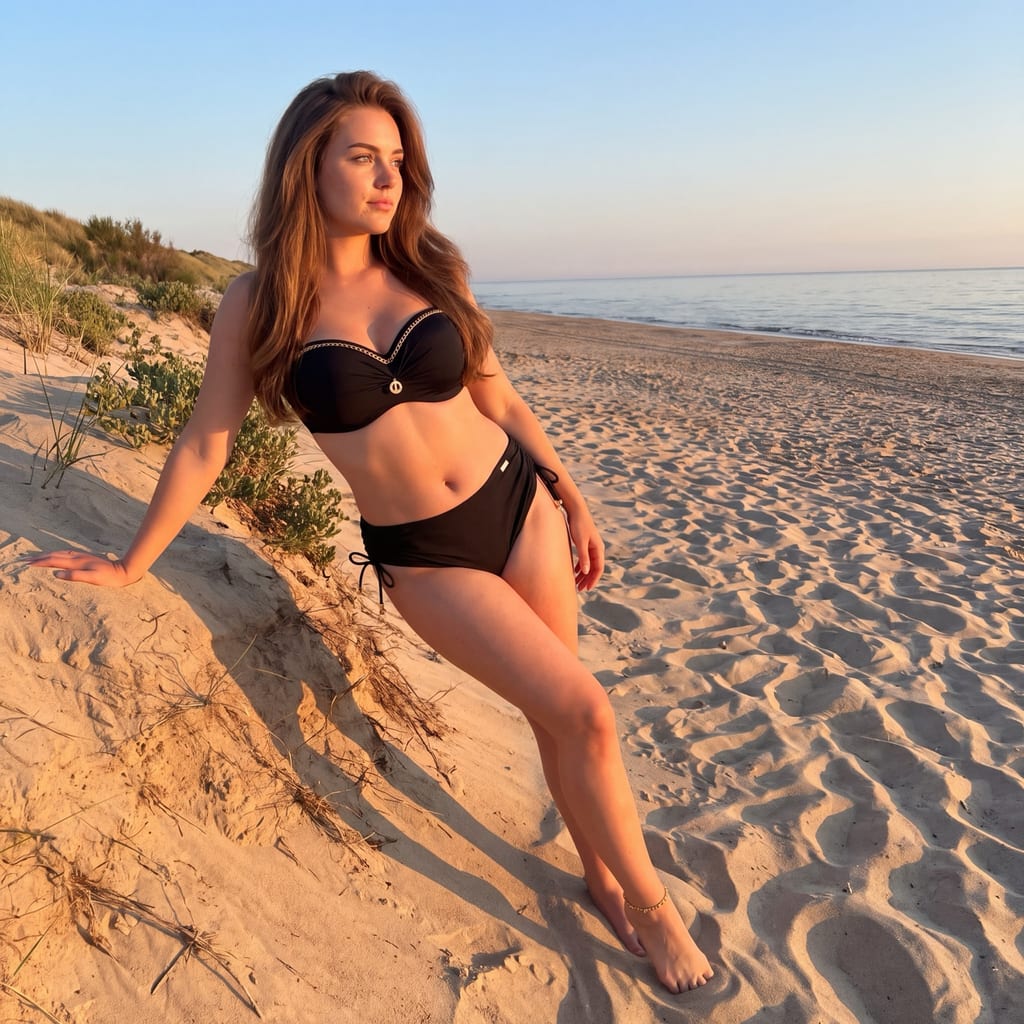
Galeria
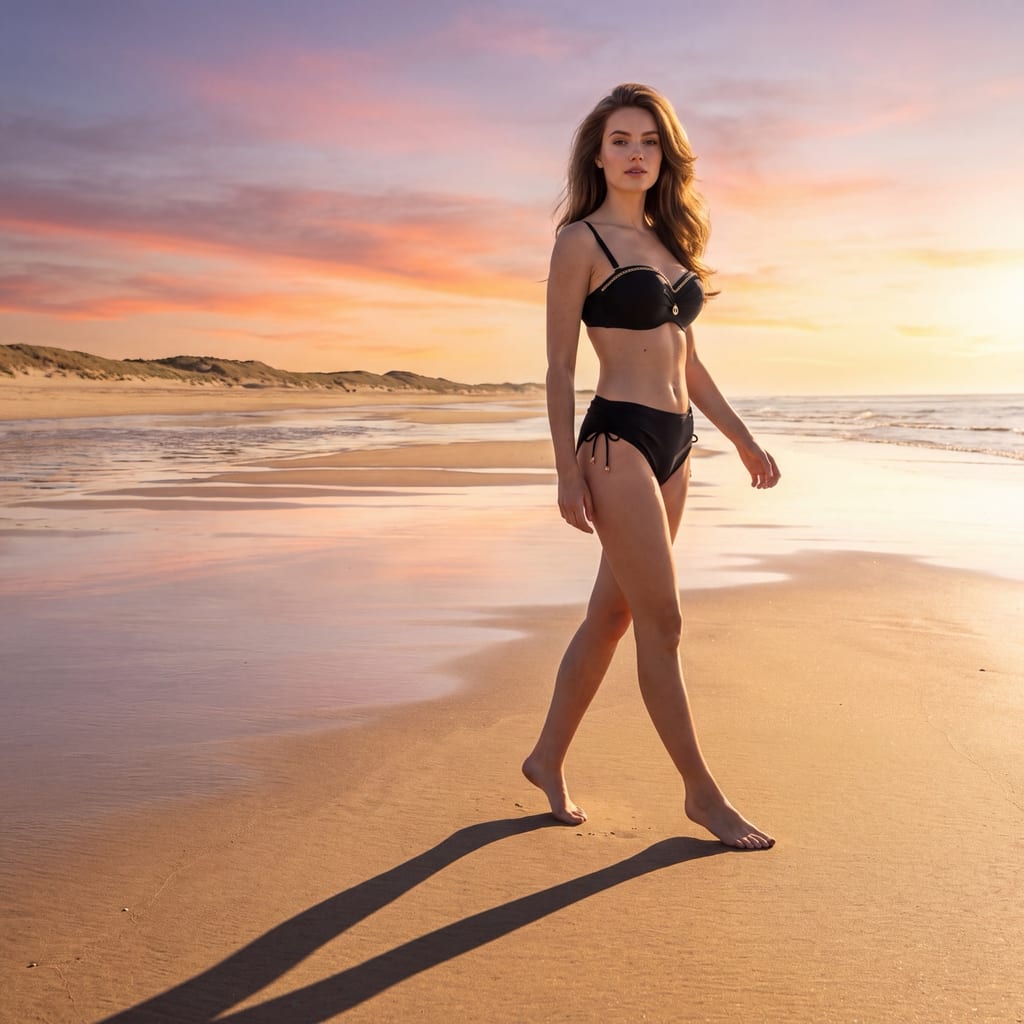
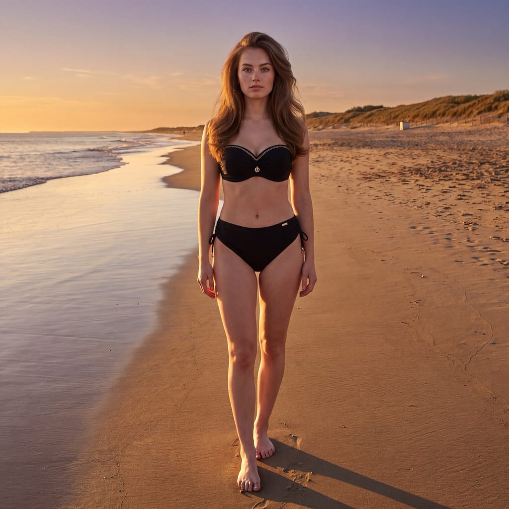
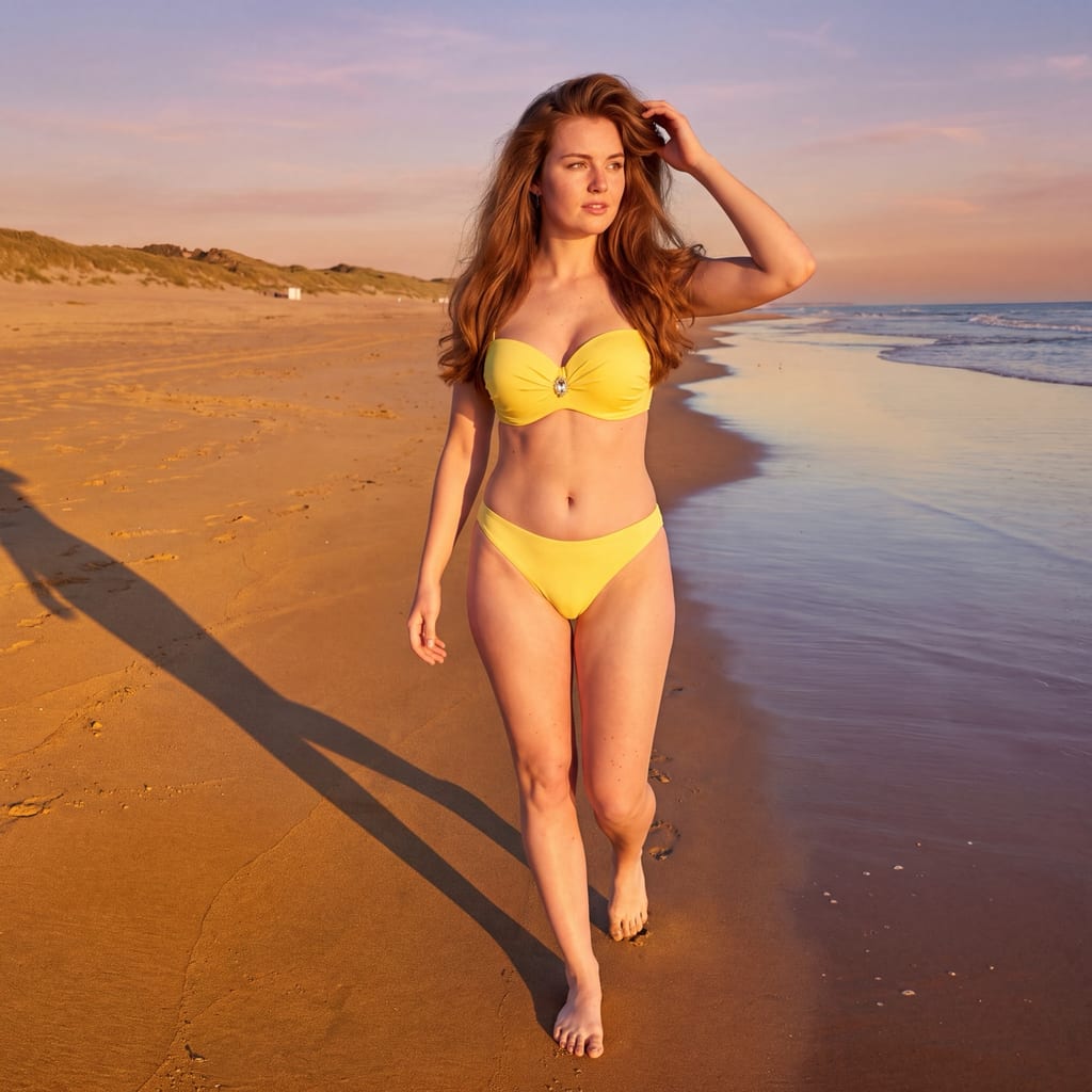
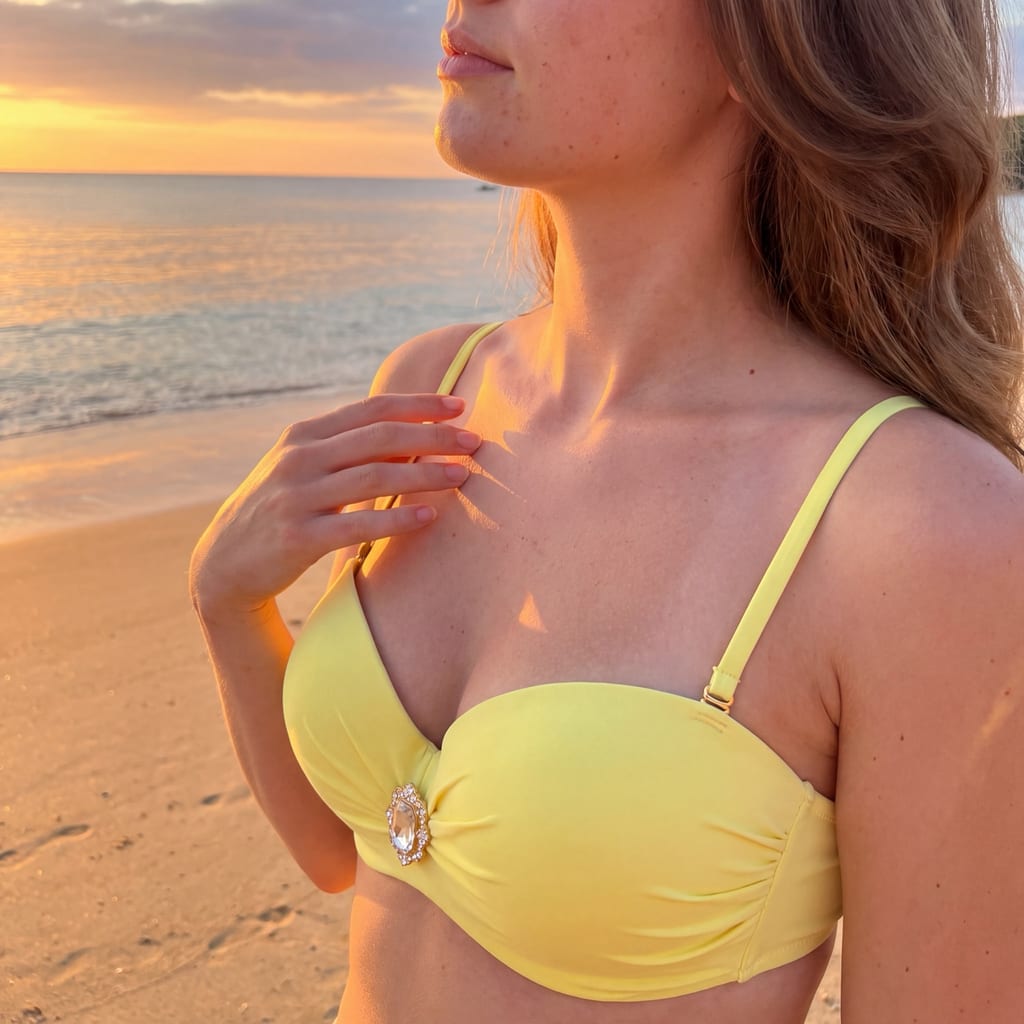
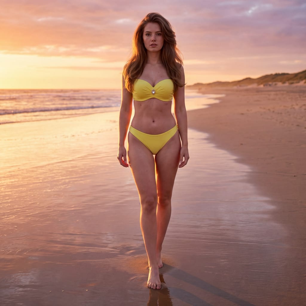
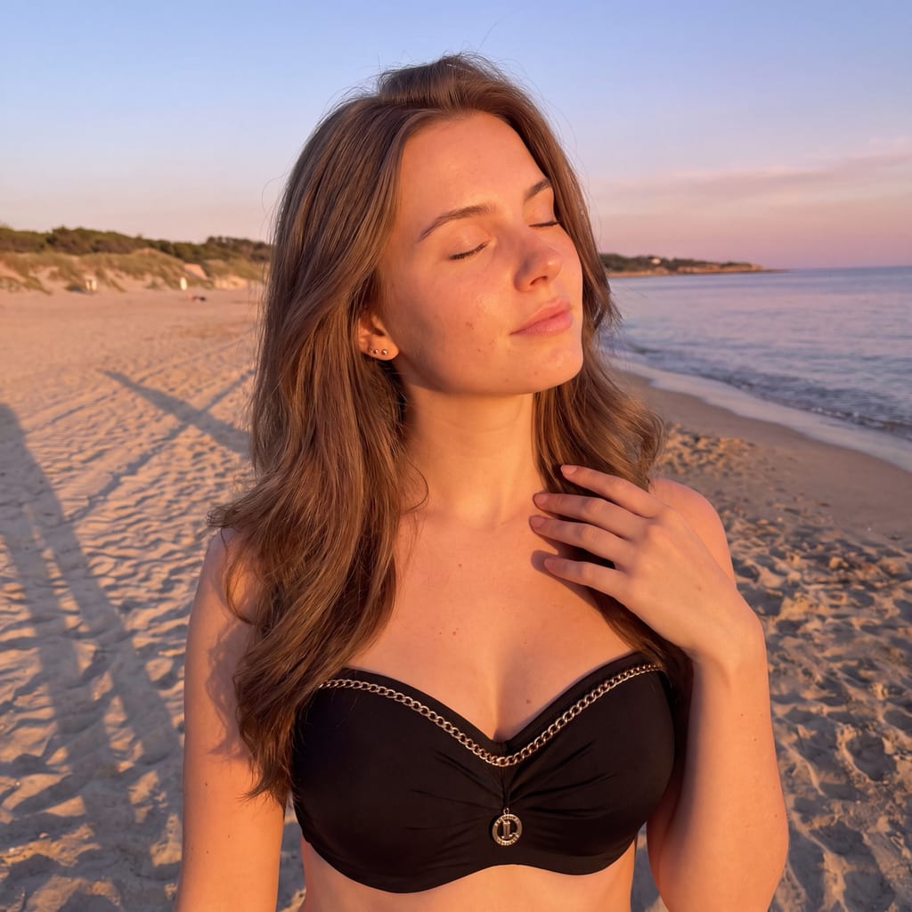
Najlepsze do
Najlepszy do kampanii letnich, key visuali sezonowych, lookbooków kolekcji, paid social i banerów kategorii dla swimwear oraz odzieży plażowej. Wybieraj go, gdy potrzebujesz jednego mocnego, rozpoznawalnego obrazu na sezon i chcesz, żeby zdjęcie działało również jako miniatura. Szczególnie dobrze wypada przy fasonach o wyraźnym kroju, mocnym kolorze albo printcie — twarde światło rysuje krawędzie, taśmy i szwy.
Wymagania wejściowe
Wybieraj produkty, które wytrzymują mocne światło i mocny kolor — wyraziste kroje, nasycone barwy, czytelne konstrukcje. Wgraj packshot tej strony produktu, którą chcesz pokazać: sesja fotografuje jedną stronę (przód ALBO tył). Modelkę (karnację, budowę, niedoskonałości skóry) ustawiasz w modelce — styl jej nie wygładza. **Sceneria nie jest wymagana: styl ma własną, ciepłą tynkowaną ścianę w twardym słońcu.** Jeśli podpinasz własną scenerię, wybierz nasłonecznioną scenerię architektoniczną — to ona poprowadzi miejsce, a styl doda swoje twarde, jednokierunkowe światło.
Wytyczne jakościowe
## Quality guidelines ### Style core A graphic summer campaign register for swimwear photographed against a warm, matte plaster wall in hard, high sunlight — images built around the shadow the sun throws. The world is deliberately bare: one sunlit plaster plane, one sun, one figure and the dense, crisp shadow that figure and the architecture cast across the wall. The register is directed and composed, not caught: the model holds a considered, readable shape, the frame is planned so the shadow lands where the composition needs it, and the picture reads as a designed seasonal asset rather than a moment. This is decidedly NOT a soft coastal frame, NOT a poolside holiday scene and NOT a candid street picture — the whole value sits in the hardness and the single direction of the light. The strength of the image comes from contrast, geometry and the drawn edge of a shadow; the mood is bright, dry, confident and mid-afternoon. - Commerciality level: mix of `campaign` and `lookbook` — a strong seasonal image that still sells the garment - Dominant character: graphic, hard-lit, warm-architectural, dry, composed, confident, contemporary summer - Image priority: the light and the composition LEAD the feel — the sun's drawing on the wall is the subject of the frame; the garment stays readable and correctly coloured in every frame, and the body carries the shape that the shadow repeats - Directional references: contemporary swimwear campaign shot at a sunlit plaster wall, seasonal key visual built on a single hard sun, architectural summer lookbook, graphic shadow play as art direction - Style-anchoring words: hard high sun, one shadow direction, warm matte plaster, cast shadow as composition, dry and graphic, never hazy ### Product role in frame The product (swimwear, and swim-adjacent apparel such as a cover-up worn as part of the look) is worn and stays readable in every frame — cut, coverage, strap and band placement, fabric tension and construction must read, because the style still sells a garment in the season it was made for. Hard light is unusually good at this: at this angle every strap, edge, seam and fold draws its own small, crisp shadow, so construction reads in relief rather than needing a close crop. The same light is unforgiving about placement, which is why one rule is absolute: **the garment sits entirely inside the sunlit zone in every frame** — one exposure, one lighting condition on the product, no architectural shadow edge crossing it and no frame that hides the product in the wall's shade. When the garment's own hue sits close to the model's skin tone (nude, blush, ivory, tan), the hard edge the light draws along every band and seam is what keeps the outline visible against the body. When the input shows the back of the product, the back of the garment is the readable subject and the model is posed from behind. - Product role: hero on the silhouette — the garment leads as the readable subject; the light, the shadow and the pose amplify it, never bury it - Visibility level: readable in every frame — fully readable in the clear majority (fit, cut and fabric read at a glance), and in a minority partially obscured by pose, an arm or a crop while cut and fit still read; plus a construction/material detail layer - What the style exposes: cut and coverage on the body, strap and band placement, the relief of seams, edges, ties and closures drawn by the hard light, fabric tension and surface, the outline the garment builds against the plaster - Skin-to-garment separation: the hard directional light draws a crisp shadow line along every band, cup and hem, so the garment's edges hold against close-toned skin - Lighting zone: the garment stays in full sun across the whole pack — never split between sun and shade inside one frame, never resolved in the wall's shadow - Acceptable obscuring: moderate — an arm, a turn or a crop may cover part of the garment in a minority of frames if cut and fit still read; never unreadable in the core - Product presentation character: graphic, confident, seasonal, clearly sellable ### Light Default light — applied when no scenery is linked, or when the linked scenery does not name a directional light, a time of day or weather: ONE direct, unfiltered sun in a clear sky, at ~55° azimuth off the camera–model axis, on the camera side, sitting high — roughly 60° above the horizon, well past mid-sky and short of the zenith (the ~55° is azimuth measured from the camera–subject axis, not from the wall; the ~60° is the sun's elevation). The shadow it throws is short, compact and dense, with a crisp drawn edge. There is no artificial fill: the only fill is the warm bounce off the sunlit plaster and the pale ground, which keeps the shadow side warm and legible instead of empty. Discipline — always, whatever the light source: one hard, single-direction sun with a crisp, physically true cast shadow, high light-to-shadow contrast, and no fill beyond the environment's own warm bounce; this hardness and single direction apply on top of whichever source is resolved, so a linked scenery may set WHERE the sun stands, and the preset keeps the hard, uncompromised CHARACTER of the light. The sun does not move between frames. Whatever the camera setup, the sun keeps its position relative to the wall and the model, so the direction and length of the cast shadow are identical across the whole pack — that constancy is the series signature, and a drifting shadow direction is what breaks a hard-light pack apart. - Source type: natural, direct, unobstructed sunlight in a clear sky; no strobe, no reflector, no second source - Default source direction: ~55° azimuth off the camera–model axis, on the camera side, at ~60° elevation above the horizon — applied when no scenery is linked, or when the linked scenery does not name a directional light, a time of day or weather - Hardness: hard — a point-source sun; shadow edges drawn with a narrow, crisp transition - Light-to-shadow contrast: high (discipline — this is the register), with the lit plane brilliant and the shadow dense but still carrying its surface - Role of fill: the warm bounce off the sunlit plaster and the pale ground only; it keeps the shadow side warm and readable, and it is the only fill in the setup - Shadow quality: hard-edged, compact, dense and warm — a drawn shape, not a soft gradient - Cast shadow: a subject of the frame in its own right — the model's shadow on the plaster and the shadows of the architecture (a reveal, a parapet, an eave, a shutter) or of something outside the frame, falling across the wall and the ground as graphic pattern - Color temperature: neutral daylight; the preset's neutral daylight white balance applies only when the preset's default light is the source. The warmth in the frame comes from the plaster's own colour and its bounce, not from the grade - What the light should model: the plane and tooth of the plaster, the relief of the garment's construction (every strap, edge and seam drawing its own small shadow), the geometry of the body, and the shadow it throws - Face in hard light: in frames where the face reads, the head is carried into the sun — chin lifted or turned toward the light — so the eyes stay open, lit and legible - Light discipline (always, whatever the source): one hard, single-direction sun, a crisp physically true cast shadow, high contrast, and no fill beyond the environment's own warm bounce ### Color and tonality Warm, bright, high-contrast tonality built from two facts: the plaster is warm and the light is neutral. The default background (used only when no scenery is linked) is ONE warm, matte plaster tone — sRGB #E8D3BC ≈ CIELAB L* 86 / a* 4 / b* 14 — and that value describes the **sunlit plane** of the wall; the wall's shadowed zones fall away from it and stay warm, never neutralised toward grey. This is deliberately not a neutral studio value and not a faded coastal palette: the wall is a warm cream-ochre lime plaster in brilliant sun. White balance is neutral daylight, so the garment's own hue is exact and the warmth reads as a property of the wall rather than of the grade. Saturation is natural to rich — colour is strong here because the light is strong, not because the grade pushes it. Contrast is high, with the sunlit plane brilliant and the shadows deep, warm and still holding their surface. - Palette: warm plaster + pale sun-bleached ground + real skin + the garment's own hue as the one strong colour in the frame, with an optional band of deep clear sky - Background tone (default, closed axis): sRGB #E8D3BC ≈ CIELAB L* 86 / a* 4 / b* 14 — one single value describing the sunlit plaster plane, never a family, never a range, never drifting toward neutral grey, pink, sand-brown or bleached white between frames - White balance: neutral daylight; follows the resolved light source; the preset's neutral daylight value applies only when the preset's default light is the source; the grade never recolours a linked scenery - Saturation: natural to rich — sunlit colour, never faded, never washed, never neon - Contrast: high (discipline — the register lives on the distance between the lit plane and the shadow) - Exposure: set for the sunlit plane and the garment; the plaster's highlight keeps its texture; the shadows sit deep and warm with detail intact - Highlights character: held and warm-neutral; the lit plaster keeps its surface rather than burning to paper white - Shadows character: warm, dense, transparent enough to read — carrying the plaster's own colour and the ground's bounce - Blacks: deep and warm, with detail; a dark garment keeps its internal structure - Whites: clean daylight-neutral; a white garment separates from the warm plaster through the difference in hue and the drawn shadow edge, never by recolouring the wall - Overall tonal character: bright, warm-architectural, high-contrast, contemporary summer campaign — dry and saturated, never hazy and never faded - Faithfulness of the product's own hue takes precedence over everything else in this section; the grade never recolours a linked scenery ### Lens and perspective feel One pinned focal length: **~85mm in feel, fixed for the whole session and written identically on EVERY frame** — one single value for the entire session, no ranges (never write "50–85mm in feel"), and never taken from the scenery. The choice is deliberate and specific to this world: the subject sits immediately in front of a flat plane, so a short portrait length keeps the plaster reading as one uniform field of colour, binds the figure and its cast shadow into a single graphic shape, and holds the pull an architectural setting exerts toward a wide, real-estate framing. It also keeps face geometry constant across a stateless pack. A wider length (down to ~50mm in feel) is allowed ONLY when the idea explicitly calls for a full-length hero that shows the wall's architecture as a whole — never as a per-frame default, and always resolved to ONE concrete value. Aperture / depth of field is a closed axis resolved once for the whole session: ONE moderately deep value (~f/8 in feel), held identical across every frame and never sourced from the scenery. Depth is not the tool here — the world is flat and separation comes from tone and the drawn shadow, not from blur. What the closed aperture buys is what the style is made of: the plaster's tooth stays legible, the shadow edge stays crisp, and the garment is sharp from strap to hem. It is also what a real camera does in this light at low ISO. - Focal length: PIN ~85mm in feel — one single value for the entire session, no ranges (never write "50–85mm in feel"); a wider ~50mm in feel ONLY when the idea explicitly calls for a full-length hero showing the whole wall, never as a per-frame default; never taken from the scenery - Aperture / depth of field: ONE moderately deep value (~f/8 in feel) for the whole session, held identical across every frame; plaster texture and shadow edge legible, garment sharp end to end; never sourced from the scenery - Camera distance: medium to medium-far so the figure and its shadow read together; closer for the construction detail layer — all at the same focal length - Perspective: eye level as the base; a deliberate slight low angle as the register's device (figure and shadow rising against the plane); a high angle only as a rare accent - Sharpness character: as a real lens renders it in direct sun — crisp because the light is crisp, never synthetically over-crisp, never soft dreamy - Gear character: a full-frame camera with a short-portrait prime, direct sunlight, low ISO, very fine grain - Aspect ratio: no rigid requirement; the prompter picks (campaign/e-commerce usually 2:3 / 4:5, social 4:5 / 9:16); the format should hold the figure and its cast shadow inside one frame ### Composition language The frame is composed from three elements and nothing else: the flat sunlit plane, the figure, and the shadow as a second graphic mass. The figure is placed with clear geometric intent — usually offset, so the shadow has room to fall into the frame rather than out of it — and the remaining plaster is left deliberately empty, working as the composition's counterweight. The straight lines the architecture supplies (the wall's top edge, a reveal, a step, a shutter, the line where wall meets ground) are compositional tools and stay geometrically true, with verticals vertical. One to two planes only; in a minority of full-length frames the wall's top edge and a band of deep, clear sky close the frame. Separation from the background comes from tone and from the drawn shadow edge along the body, never from blur and never from a rim-light effect. Negative space is medium to high and it is real, empty plaster — which makes roughly a fifth of the pack incidentally usable for a headline, without the style ever being designed around a layout. - Frame type: leads with full silhouette and 3/4-length / American frames (the figure and its shadow read together), a portrait / bust share carrying the face in hard light, plus a construction/material detail layer - Object placement: deliberately offset with clear geometric intent (rule of thirds / golden ratio), chosen so the cast shadow lands inside the frame - The shadow as composition: treated as a second subject with its own weight and direction; the frame is built on the relation between the figure and its shadow - Architectural discipline: verticals stay vertical, the wall's lines stay straight, the geometry of the plane stays physically believable - Background hygiene: the area behind the head and shoulders stays clear of intersecting lines; the wall's horizontal lines do not cut the body at a joint - Negative space: medium to high — an empty field of sunlit plaster as counterweight - Symmetry: controlled asymmetry as the rule; frontal symmetry only when the architecture itself supplies it - Open / closed composition: mixed, close to balanced — closed body-led frames alternate with open frames where the empty plane carries the picture - Number of planes: one to two — the figure against the plaster plane, with an occasional near architectural element or the ground as a shallow second layer - Separation from background: tonal contrast plus the drawn shadow edge along the body - Room for copy: a by-product of the empty plane in a minority of frames, never the design goal of the style - Overall composition character: graphic, architectural, campaign — planned, not caught ### Pose language Posing is controlled, composed and graphic — the body makes clean, deliberate shapes that stay legible **as an outline**, because the wall repeats every pose as a shadow. That is the governing rule of this register: a shape that turns to a blob in silhouette is the wrong shape here, so limbs are separated from the torso line, angles are held, and the gesture is chosen for what it draws. Amplitude is medium and campaign-grade: contained worked stances, a lifted or angled arm whose shadow crosses the plaster, a strong diagonal through the body, a shoulder or back braced against the wall, a step along it. Contact with the wall is STRUCTURAL — a support and a counterforce for the line — never a domestic or lifestyle action. Expression is composed, confident and sun-facing: still, adult, present. This is not the playful, laughing register of a styled terrace and not an un-posed candid look; it is also not high-drama melodrama. The garment stays readable as a floor while the body and the shadow carry the graphic weight of the frame. - Expression: composed, confident, self-possessed, sun-facing; reads whenever the face is visible; defaults away from a played-up smile, coyness or campaign melodrama - Pose dynamics: semi-static to semi-dynamic — held worked shapes and suggested motion (a step along the wall, a turn, an arm rising into the light) - Pose amplitude: medium and deliberate — from contained held stances to a bold campaign shape; the amplitude serves the outline, not the drama - Silhouette legibility: every pose stays readable as a shape, because the wall repeats it; limbs read separated from the torso outline wherever the shape allows - Body openness: mixed — the body may angle and twist to build geometry against the plane - Line tension: medium-high — held angles and clean diagonals, elongation without overload - Posing character: `fashion` in a graphic key — camera-aware, form-aware, composed - Contact with the wall: structural — a shoulder, a back, a palm, a braced foot, a seat on a low step; always to build or hold a line, never a narrative action - Head in hard light: the head is carried into the sun (chin lifted or turned toward it) in the frames where the face reads, so the eyes stay lit and open - Eye contact: mixed — a composed direct gaze, a look off-frame along the wall, or eyes closed with the face turned into the sun as an on-register accent - Spontaneity level: directed — the frame is placed and held, with enough real weight in the body that it does not read stiff - Body-to-product relationship: the body builds the graphic shape; the product stays readable and correctly lit in every frame ### Movement and physics The style is essentially frozen. Motion exists as a device, not as a subject: a step along the wall, a turn, an arm rising, a warm breeze lifting hair in a minority of frames — all held inside a sharp, readable image, with no motion blur anywhere and least of all on the product. What matters more here than movement is the physics of the light. The shadow obeys the sun: one direction, one length, attached to the figure at the ground, bending where it climbs the wall and breaking where it crosses a reveal or a step. Fabric behaves under real gravity, and in this light every fold, strap and edge draws its own small hard shadow — that relief is the style's proof of physical presence, and it is also how the garment's construction reads. Where the body braces against the plaster, the contact is load-bearing: the surface takes the weight and the hand or shoulder flattens slightly against it. - Static vs movement: essentially frozen; suggested motion (a step, a turn, a rising arm) held within sharp readability - Frozen vs blur: fully sharp; at most a subtle cue in hair ends, never on the product - Shadow physics: one direction and one length across the pack; the shadow attaches at the feet, climbs and bends on the wall, and breaks across architectural edges - Fabric physics: real gravity; every fold and edge draws its own small hard shadow - Contact physics: load-bearing and believable — real weight against a real surface - Elements: dry and minimal — a warm breeze in hair in a minority of frames; no water, no spray, no wind-machine drama ### Relation to scenery The style's world is one specific place, and it is the preset's own default rather than a location statement. Default world (used only when no scenery is linked): ONE warm, matte, hand-finished plaster wall in direct sun — lime or clay plaster with a visible float texture and small honest surface imperfections, standing on a pale, sun-bleached stone or concrete ground, with at most one or two simple architectural features (a shallow reveal or return, a square opening with a closed shutter, a low step or parapet, a projecting eave line). Nothing narrative, nothing decorated, no vegetation as set dressing — though the hard shadow of something outside the frame, an eave, a railing or a palm frond, is welcome as graphic pattern across the plaster. Which of those features enter a given frame is an open axis; the wall type, its pinned sunlit tone and the sun stay locked for the whole pack. A linked scenery owns the location and backdrop when the user supplies one, and the preset's hard, single-direction sun discipline then applies on top; this style is at its best with a sunlit architectural scenery or with none at all. - Relationship to space: one flat, warm, sunlit architectural plane by default; a linked scenery leads the location when supplied - Scene depth: flat to shallow — one to two planes; the figure works against the plane, not inside a landscape - Background activity: none of its own — the wall is a silent surface whose only events are its texture, its edges and the shadows that fall on it - Space scale: intimate to human; a wall, never a monument and never a vista - Default background tone: the warm plaster tone #E8D3BC (CIELAB L* 86 / a* 4 / b* 14) — one value describing the sunlit plane, not a range, not a family; used only when no scenery is linked - What the world locks: the wall type and its finish, the pinned sunlit tone, the sun's position and hardness, one shadow direction. What stays open: which architectural features and which cast patterns enter a given frame - The attached scenery owns the location and backdrop when linked; the preset's hard single-direction light discipline, camera pins and grade discipline still apply on top of the resolved source, and the scenery never supplies focal length, aperture / DoF, render character or grade ### Props and styling behavior The style adds no objects of its own and needs none — the shadow does the work a prop would do elsewhere. Nothing from a holiday scene belongs here: no towel, no lounger, no drink, no basket, no styled clutter. Whatever is physically present comes from the architecture (a step, a shutter, a parapet) and stays passive: the model may brace against it, never use it narratively. Accessories on the model are optional and minimal — a single sculptural piece, delicate jewelry, or a strong-lined sandal — and they are a SESSION styling layer added in a minority of frames, NOT part of the base model identity (accessories baked into the model return in every frame and break the register). Bare feet are the native default. Eyewear, if it appears at all, is one incidental sculptural piece in a small minority — it is not this preset's signature, because the signature is the light. The preset does not set the model's hair styling, make-up or skin finish — these come from the casting card (Mannequin input) and the preset must not override them. - Objects in the frame: only the architecture the world supplies; passive, never used narratively - Accessories: optional and minimal — a single sculptural piece, delicate jewelry, a strong-lined sandal, in a minority of frames - Footwear: bare feet as the default; a strong-lined sandal as a minority accent - Accessories = session styling layer, not the model's identity — the model is a separate, clean input (frequency is set in Quantity) - Hair, make-up and skin come from the card; the preset only asserts non-override (it does not smooth, restyle or beautify them) - Hair movement as a POSE cue stays available: hair may be lifted by a warm breeze in a minority of frames (motion, not a hairstyle spec) - Avoid (Prompter instruction — formulate final values positively): holiday-scene props, beach clutter, set dressing, decorative vegetation, anything that turns the bare wall into a narrative set and competes with the garment and the shadow ### Post-production and finish Finish is bright, warm-architectural and true to what the camera recorded — a photograph made in hard sun, not an image built in the grade. The contrast, the crispness and the saturation all arrive from the light itself, so post adds nothing: no creative grade, no added crunch, no lifted shadows that would flatten the wall's sunlit-to-shadow division. Grain is very fine and present rather than wiped to zero, because it is one of the cheapest carriers of photographic character and it costs nothing in a bright frame. Texture stays as recorded: the plaster's tooth and the fabric's weave both legible. Retouch is minimal — light cleanup only, never at the cost of skin or fabric texture. The preset does not specify the model's skin, make-up or hair; it only requires that the render not smooth away or override the skin realism and identity supplied by the Mannequin input. No vignette: any darkening at the frame edge comes from the wall's own shadow zones. - Grain: very fine, present and visible on close inspection; not heavy, not wiped to zero - Texture: as recorded — the plaster's tooth and the fabric's weave stay legible - Clarity: photographic — the crispness comes from direct sunlight and the lens, not from added micro-contrast; the shadow keeps its density and is never lifted in post - Vignette: none; edge darkening comes only from the wall's real shadow zones - Retouch: minimal — light cleanup only, never at the cost of skin or fabric texture - Skin: the preset does not specify the model's skin, make-up or hair; it only requires that the render not smooth away or override the skin realism and identity supplied by the Mannequin input - Colour: the garment's hue exact; the warmth in the frame belongs to the plaster, not to a grade - Overall finish: bright, dry, warm-architectural, campaign-ready, true to the exposure ### Style render properties - Render character: true-to-life photographic rendering. The frame must read as a real photograph taken with a real camera in real sunlight — a full-frame camera, a short-portrait prime, direct sun, low ISO, very fine grain. Carry this into `Rendering_Style` as its own value — `True-to-life photographic rendering.` — and resolve it identically on every frame of the session. The style's register (summer campaign, lookbook, graphic) belongs in `Session_Concept` and `Output_Goal`; `Rendering_Style` carries ONLY the photographic character, never a genre label, never a quality or fidelity adjective. - Light must read as ONE direct, hard, unobstructed sun — by default at ~55° azimuth off the camera–model axis, on the camera side, at ~60° elevation above the horizon — casting a short, compact, crisp-edged shadow, with high light-to-shadow contrast and no fill beyond the warm bounce off the sunlit plaster and the pale ground. This hardness, this single direction and this contrast apply on top of whichever light source is resolved. - The cast shadow is a compositional subject, not a defect: the model's own shadow on the plaster, and the shadows of the architecture or of objects outside the frame, fall across the wall and the ground as drawn graphic shapes. The shadow direction and length stay identical across the whole pack — the sun does not move between frames, whatever the camera setup. - The garment sits entirely inside the sunlit zone in every frame — one lighting condition on the product, never split between sun and shade, never resolved in the wall's shadow. Fit, cut, strap and band placement, seams and closures read; the hard light draws each of them in relief, and every garment edge holds against close-toned skin. - The default background (used only when no scenery is linked) reads as ONE warm, matte, hand-finished plaster wall in direct sun — sRGB #E8D3BC ≈ CIELAB L* 86 / a* 4 / b* 14 for its sunlit plane, with a visible float texture and small honest surface imperfections; its shadowed zones fall away from that value and stay warm. Never a neutral grey studio plane, never bleached white, never a faded coastal tone, never a different value between frames. When a scenery is linked, the scenery owns the background. - White balance is neutral daylight and follows the resolved light source; the preset's neutral daylight value applies only when the preset's default light is the source. The warmth in the frame comes from the plaster and its bounce, never from the grade; the garment's own hue stays exact and the grade never recolours a linked scenery. - Focal length is PINNED at ~85mm in feel and aperture at ~f/8 in feel for the whole session — one value each, never a range, never taken from the scenery — so face geometry and proportions stay constant, the plaster's texture and the shadow edge stay legible, and the garment is sharp from strap to hem. - The preset does not specify the model's skin, make-up or hair; it only requires that the render not smooth away or override the skin realism and identity supplied by the Mannequin input. - Pose reads composed, held and graphic — a deliberate shape that stays legible as an outline, because the wall repeats it as a shadow. Contact with the plaster is structural and load-bearing. Expression reads composed, confident and sun-facing, with the head carried into the light so the eyes stay lit and open in the frames where the face reads. - Very fine grain is present in the image and stays consistent across the pack; the frame reads as recorded, with the shadow keeping its density. - Architecture and physics stay believable: verticals vertical, the wall's lines straight, the shadow geometrically consistent with the sun's position, body proportions true, and the deliberate slight low angle used as a device without deformation. - Overall the image must feel like a summer campaign photographed at one sunlit plaster wall — hard, dry, graphic and physically present — not a soft hazy coastal frame, not a poolside holiday scene, not a styled terrace with props, and not a studio setup dressed as an exterior. ### Allowed variability Variability applies only to the open axes. What stays disciplined across frames is the preset's own DNA: the hard single-direction sun with its pinned azimuth and elevation, one shadow direction, the absence of any fill beyond the environment's warm bounce, the locked plaster world and its pinned sunlit tone, the pinned ~85mm focal and ~f/8 aperture, the neutral daylight white balance and high-contrast grade, the composed graphic pose register and the rule that the garment stays in full sun. Everything below is open. - The exact pose, body angle, limb arrangement and suggested motion may vary — held stances, a rising arm, a step along the wall, a braced shoulder, a strong diagonal — as long as the shape stays legible as an outline and the product-readability floor holds. - Head and face angle may vary (frontal, three-quarter, profile, turned into the sun), including poses from behind; model identity is carried by the Mannequin input regardless. - Camera angle and height may move from eye level to a deliberate slight low angle, and to a rare high accent; the camera may also work from a different position along the same wall. - Frame / crop (full silhouette ↔ 3/4-length ↔ bust/portrait ↔ construction detail) and micro-composition may change — always at the pinned focal length. - Which architectural features enter the frame (a reveal, a step, a shutter, a parapet, an eave line, the wall's top edge with a band of sky) is open, and so is which cast pattern from outside the frame crosses the plaster. - Gaze may change (composed direct, off-frame along the wall, eyes closed into the sun, downward along the body line). - The presence of a single accessory or a strong-lined sandal may appear and disappear between frames (session layer, a minority of the pack). - The degree of partial product obscuring may vary within "still readable in the core of the pack". - What may NOT vary: the sun's azimuth, elevation and hardness; the shadow direction; the absence of artificial fill; the plaster world and its tone; the focal length; the aperture; the neutral white balance; the rule that the garment stays in full sun. ### Session-level consistency Across the whole pack these stay constant, because the Prompter is stateless: the same one warm plaster wall (its sunlit plane at #E8D3BC ≈ CIELAB L* 86 / a* 4 / b* 14 whenever no scenery is linked), the same one hard sun at ~55° azimuth and ~60° elevation with no fill beyond the wall's own warm bounce, and therefore the same shadow direction, the same shadow length and the same contrast in every frame; the same neutral daylight white balance and high-contrast grade; the same pinned ~85mm focal length and ~f/8 aperture; the same very fine grain; the same composed, graphic pose register with the same sun-facing expression; the same minimal-retouch skin realism from the card; and the same rule that the garment sits in full sun. The pack must read as one hour at one wall on one afternoon: it must not mix hard-lit frames with soft or hazy ones, must not swing the shadow to the other side of the figure between frames, must not drift the plaster toward grey or white, and must not put the product in shade in one frame and in sun in the next. Ten images must look like one campaign session, not ten separate attempts. ### Conflict resolution Declared hierarchy shift: this is a seasonal campaign / lookbook preset whose entire sales value is a recognizable signature — one hard sun and the shadow it draws. The coherence of that hard-lit world is therefore raised above general render realism, because a "safer", softer or filled light would produce a technically pleasant image with nothing left to recognize. Product readability stays first: it still sells swimwear, and hard light is capable of serving both. 1. Product readability and colour fidelity: the garment fully readable and correctly exposed inside the sunlit zone, its hue exact, its construction drawn in relief, its edges holding against close-toned skin. 2. Consistency of the hard-sun world: one sun anchor with one azimuth and one elevation, one shadow direction, one wall and its tone, one grade, one camera — including the physical truth of the cast shadow, which must obey the sun's stated position. 3. Realism and render believability: true-to-life photographic rendering, real skin from the card (non-override), true proportions at the pinned focal length, believable architecture and load-bearing contact. This preset consciously does not run the raking-light realism stack — the register is graphic and the high hard sun is the signature — but nothing here licenses a smoothed or synthetic image. 4. Graphic accents: shadow play, bold geometry, the strongest campaign shapes of the pack. When a linked scenery's own space conflicts with the preset's default wall, the scenery wins the location (below product readability, render realism and model identity, which stay higher). The preset's default light and default world apply for sessions without a scenery, or when the linked scenery does not name a directional light, a time of day or weather; a qualifying scenery's light leads, and the preset's hard, single-direction light discipline always applies on top. The focal and aperture pins are never overridden by the scenery — only a per-batch Idea/suggestion may move them. If a composition would place the garment across the boundary between sun and shade, the frame is recomposed so the product sits wholly in the sunlit zone — the shadow gives way to the product, never the other way round. If a pose reads strongly in life but turns into an unreadable blob in silhouette, the pose is reshaped: in this register the outline is part of the picture. If a pose requires a surface the linked scenery does not contain, the pose gives way — the preset never invents architecture to accommodate it.
Wytyczne ilościowe
## Quantity guidelines ### Session goal By default 10 images in the pack. Main use: summer campaign and seasonal key visuals, lookbook and collection assets, paid social and category banners for swimwear and swim-adjacent apparel. The pack's goal is a series that reads as one hour at one sunlit plaster wall — one sun, one shadow direction, one camera — delivering both the strong recognizable image a season needs and full sales usefulness, because the garment is fully readable and correctly coloured in every frame. The pack should be identifiable as this preset from a thumbnail, by the shadow alone. ### Shot mix About 35% full silhouette (the figure and its cast shadow read together — the signature frame of this style), 30% 3/4-length / American frame (the workhorse: the garment large in frame with the wall's geometry still present), 25% portrait / bust (the face in hard light, the upper garment and the shadow of the head and shoulders on the plaster), 10% construction or material detail (a strap, band, edge, seam or closure with the light drawing its relief). The pack leads with the wider frames because the shadow needs room; the detail layer exists to prove construction, not to carry the pack. Every frame at the pinned ~85mm. When the input shows the product's back, the same shot mix reads from behind (rear bust framing, 3/4-length back, full rear silhouette, back-construction detail). ### Perspective mix Product orientation = input, not preset. The input always shows one side of the product — the front or the back — and that loaded side dictates whether the model is posed facing the camera or with her back to it. The preset does NOT redistribute or assign this (no "X% front / Y% back"); it takes the orientation from the input and only varies the camera angle and height within it. The distribution concerns the camera setup with the loaded side kept to the lens: about 30% straight on (camera frontal to the loaded side — the flattest, most graphic read of the wall), 30% a slight 3/4 camera swing (the loaded side still readable, the shadow gaining depth across the plane), 15% closer to profile as far as the loaded side stays visible (the most graphic reading of body plus shadow), 20% a deliberate slight low angle (elongation against the plane, the wall's top edge and a band of sky entering the frame), 5% a high angle as a rare accent. Angles must not deform proportions, bend the wall's geometry, rotate the silhouette so the loaded product side disappears, or kill fit readability. The sun does not move with the camera: its position relative to the wall and the model, and therefore the direction of every shadow, stays identical across the pack. ### Gaze distribution About 30% composed direct gaze to camera (present and confident, never coy), 45% off-frame — along the wall, into the distance or into the light (the register's default mode), 25% eyes closed with the face turned into the sun, or downward along the body line. The closed eyes are an on-register accent that hard light earns honestly: a face lifted into a high sun reads as a real physical response and keeps the frame from fighting the light. Whatever the direction, in the frames where the face reads the head is carried into the sun so the eyes stay lit. This applies to frames where the face is visible; in detail frames the face may fall outside the crop. ### Interaction distribution About 35% no contact — the body works its shape in the sunlit zone in front of the wall, 40% structural contact with the architecture (a shoulder or back against the plaster, a braced palm, a foot on a low step, a seat on a parapet), 25% suggested motion (a step along the wall, a turn, an arm rising into the light so its shadow crosses the plane). Contact is a strong axis here because the wall is the only thing the world contains — but it stays structural support for a line, never a domestic or holiday action, and never turns the wall into a narrative set. ### Product visibility distribution About 45% garment fully readable on the body (the sales floor — cut, coverage and construction legible at a glance), 30% garment on the body with the graphic composition leading (the shadow or the geometry carries the frame, the garment still reads), 15% partial obscuring from pose, an arm or a crop, 10% material or construction detail. Full readability stays a hard floor across roughly 45% of frames, and in all ten frames the garment sits inside the sunlit zone — the light never pushes the product into shade to serve a composition. ### Composition openness distribution About 45% open compositions (the empty sunlit plane carries the frame, the figure sits well off-centre, the shadow runs toward the edge), 55% closed, body-led frames where the worked shape fills the frame. The open share is higher than in a studio campaign pack because the wall is a real field of colour worth showing — and it is what makes a fifth of the pack incidentally usable under a headline. ### Safe vs expressive ratio About 30% safe (readable, sellable, straight-on fit that a product page could use), 50% expressive (graphic frames where the shadow, the geometry and the pose shape lead — the core of the register), 20% copy-ready (a clean, empty field of sunlit plaster beside the figure, usable for a headline or logo). Expression here works through light and composition — the hardness of the sun, the drawn shadow, the held shape — never through losing the product-readability floor or the coherence of the hard-lit world. The copy-ready share is a by-product of the world, not the design goal: a preset built layout-first exists separately. ### Spatial and depth mix About 60% the figure against the flat plaster plane (one plane, separation by tone and the drawn shadow edge), 30% a shallow two-plane frame (a near architectural element — a reveal, a step, a parapet — or the ground plane adding one layer), 10% a tighter portrait or detail frame where the plaster fills the background as pure texture. The style deliberately refuses layered depth: flatness is the point, and the shadow supplies all the graphic complexity the frame needs. In a minority of full-length frames the wall's top edge and a band of deep, clear sky close the composition. ### Recurring motifs or accessories frequency No props and no set dressing. The recurring motif is the light signature itself: one hard, high sun at a fixed position + one warm matte plaster wall + one shadow direction + high contrast — present in 10/10 frames. A hard cast shadow reads as a compositional element in 8/10 frames; within that, the model's own shadow drawn on the plaster in roughly 6/10, and a shadow cast by the architecture or by something outside the frame (an eave, a parapet, a shutter, a railing, a palm frond) in roughly 4/10 — sometimes both in one frame. Structural contact with the wall in roughly 4/10. The wall's top edge with a band of deep clear sky in roughly 2/10. A single sculptural accessory or delicate jewelry in at most 2/10, a strong-lined sandal in at most 2/10, bare feet otherwise — all a session styling layer, never baked into the model identity. The pack is recognizable by its shadow, not by anything added to the frame. ### Energy mix About 25% calm (still, sun-facing composure — the register's home), 25% sensual (warmth and body awareness held in a composed, adult key), 15% active (suggested motion — a step along the wall, a turn, a rising arm), 35% strong / campaign (the graphic hero frames where the body and its shadow build one shape). The overall level is medium with campaign peaks: this is neither the playful, laughing energy of a styled terrace nor the quiet un-posed presence of a candid pack. Even the calmest frames keep the tension the hard light creates.
Wskazówki dla użytkownika
Wybierz modelkę. Wgraj packshot jednej strony produktu. Uruchamiaj bez scenerii albo z nasłonecznioną scenerią architektoniczną — nie podpinaj scenerii pochmurnych, wieczornych ani wnętrzowych. Generuj 8–10 zdjęć naraz, żeby mieć z czego wybrać ujęcie na key visual.
Rób
Uruchamiaj bez scenerii — ciepła tynkowana ściana w twardym słońcu jest częścią stylu. Jeśli podpinasz scenerię, wybierz nasłonecznioną architekturę: mur, elewację, taras z pełnym słońcem. Wybieraj kostiumy o mocnym kolorze albo printcie — to światło je niesie. Pozwól, by cień komponował kadr: część zdjęć celowo zostawia dużą, pustą połać tynku obok sylwetki. Konkretną pozę albo kadr wpisz w sugestiach sesji; sugestie są nadrzędne nad stylem. Generuj 8–10 zdjęć naraz.
Nie rób
Nie oczekuj miękkiego, rozproszonego światła ani nastrojowej mgiełki — ostry cień jest tu sygnaturą, nie błędem. Nie podpinaj scenerii pochmurnych, wieczornych ani wnętrzowych: bez pełnego słońca ten styl traci swój jedyny mechanizm. Nie licz na wakacyjną narrację, rekwizyty ani kontakt z wodą — świat jest celowo pusty. Nie oczekuj przodu i tyłu z jednej sesji: strona produktu idzie z wgranego packshotu. Nie generuj bez modelki.
Powiązane style
Wyblakły brzeg
Wyblakły słońcem, spokojny brzeg morza jako jeden świat dla całego katalogu: ten sam piasek, to samo zawoalowane światło, ta sama ogniskowa, ta sama cisza. Produkty różnych marek zaczynają wyglądać jak jedna sesja — a kolor każdego produktu zostaje wierny.
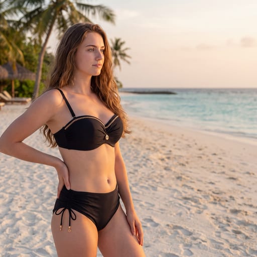
Hero z miejscem na tekst
Kadr projektowany pod layout: sylwetka po jednej stronie klatki, druga strona zostaje cicha i pusta — realne miejsce na nagłówek, CTA albo logo. Jasne, ciepłe tło studyjne, kontrolowane światło i pełna czytelność produktu w części kadru przypadającej modelce.
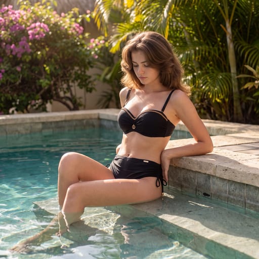
Swimwear przy basenie
Spokojny, premium rejestr basenowy dla swimwear: woda jest tematem zdjęcia, nie tłem. Modelka jest w fizycznym kontakcie z wodą — mokra, ciemniejsza tkanina, linia wody na ciele, refleksy i kaustyka — a strój zostaje czytelny w każdym kadrze.
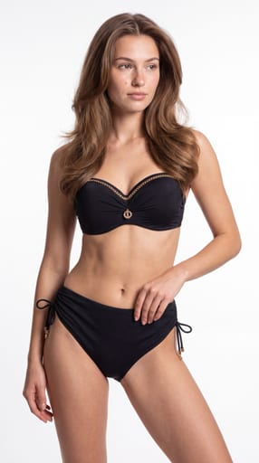
Czysty fason PDP
Czysty katalogowy styl PDP: modelka na jasnym neutralnym tle, kontrolowane światło, pół-statyczna poza. Fit, proporcje i konstrukcja produktu przed nastrojem — powtarzalna siatka zdjęć na kartę produktu.
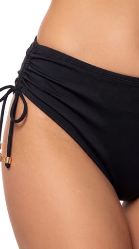
Makro detalu i konstrukcji
Studyjne makro jako dowód jakości: koronka, ścieg, fiszbina, splot, krawędź, okucie i napięcie tkaniny na ciele. Cała paczka jest warstwą detalu — 7–8 kadrów makro i półmakro plus kadry orientujące, w jednym grabiącym świetle i na jednym neutralnym tle.
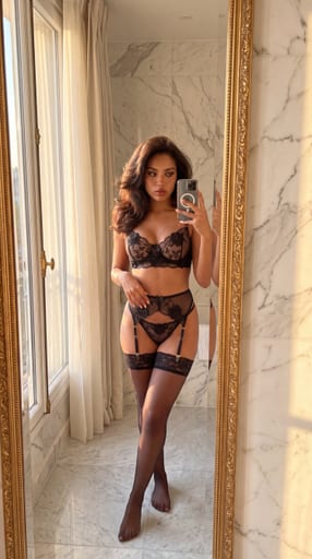
Natywny social w lustrze
Natywne treści social: pionowy kadr 4:5, lustro, telefon w dłoni i światło zastane prywatnego wnętrza. Zdjęcia wyglądają jak zrobione przez samą modelkę — ale są ostre, prawidłowo naświetlone i pełnowymiarowe, bez fejkowych artefaktów telefonu.
Gotowy, aby rozbudować swoją bibliotekę kreacji?
Dodaj ten styl do swojego konta i zacznij tworzyć lepsze kampanie w kilka minut.